Shardpunk: Verminfall
A downloadable game
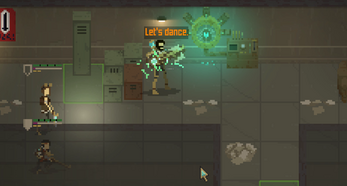
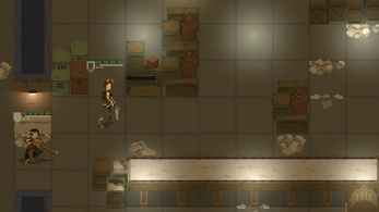
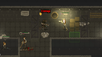
A tactical squad-based survival strategy game based in a thoroughly stylized pixel-perfect steampunk setting. Plan fights, rest at camps, juggle dwindling resources, and journey to the relative safety of bunkers, all while on the run from a swarm of vicious and heavily armed mutated rats.
Play the latest demo: https://bit.ly/3oXMnD6
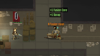
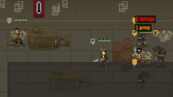
Do you plan your route to reach the stack of boxes shielding you from the two rat snipers on overwatch? Or do you take the sole fusion core in your possession and hurl it at your enemies? You go with the latter and watch core’s powerful charge annihilate enemies that were blocking the way to a door. It’s a door that sadly won't budge. The door needed a fusion core inserted in its ever-hungry socket, the same item that you exploded to defeat your rodent foes.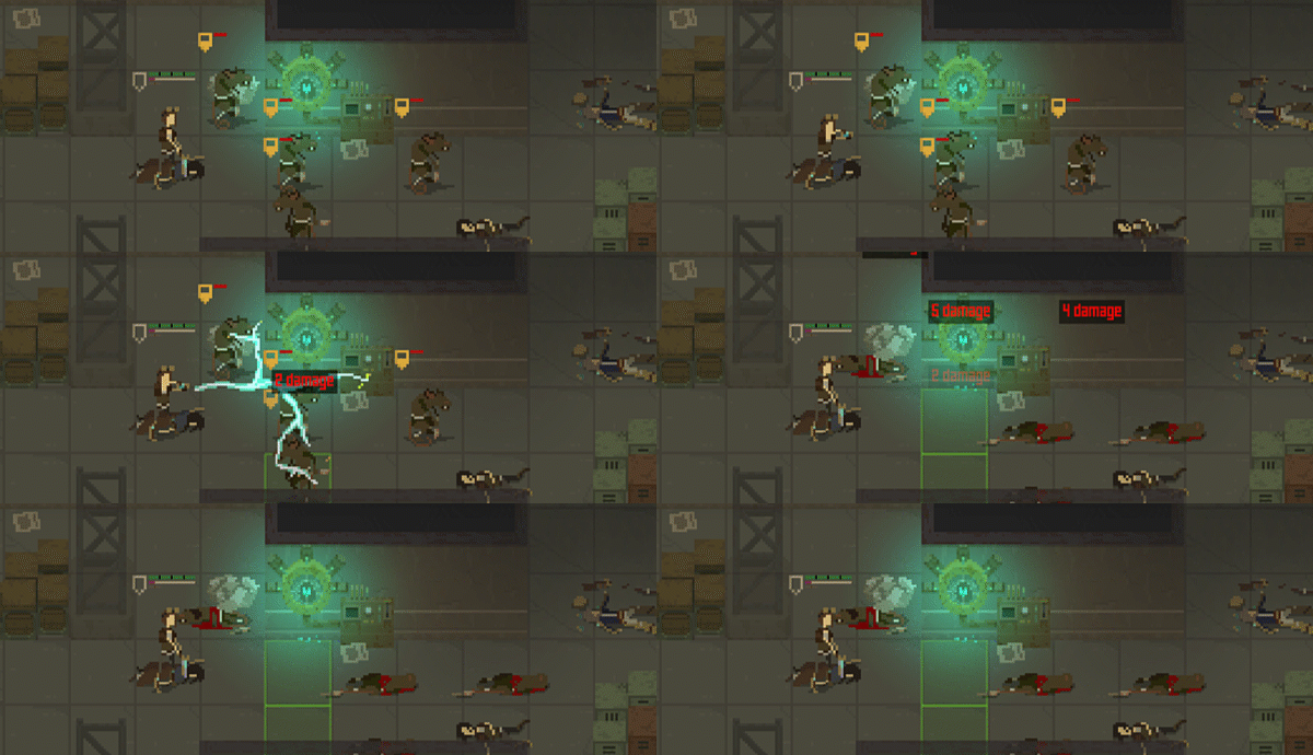
STORY
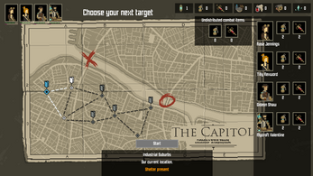
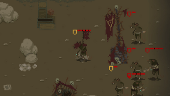
There has been an unexpected breakthrough during the long and exhausting siege of The Empire's Capital. The Rat Swarm managed to breach the walls and flood the city with vermin. You control a group of surviving city-dwellers who are trying to escape and rescue as many others as they can. They will need to scavenge the destroyed city for resources, fight off rat vermin, and escape safely from the city.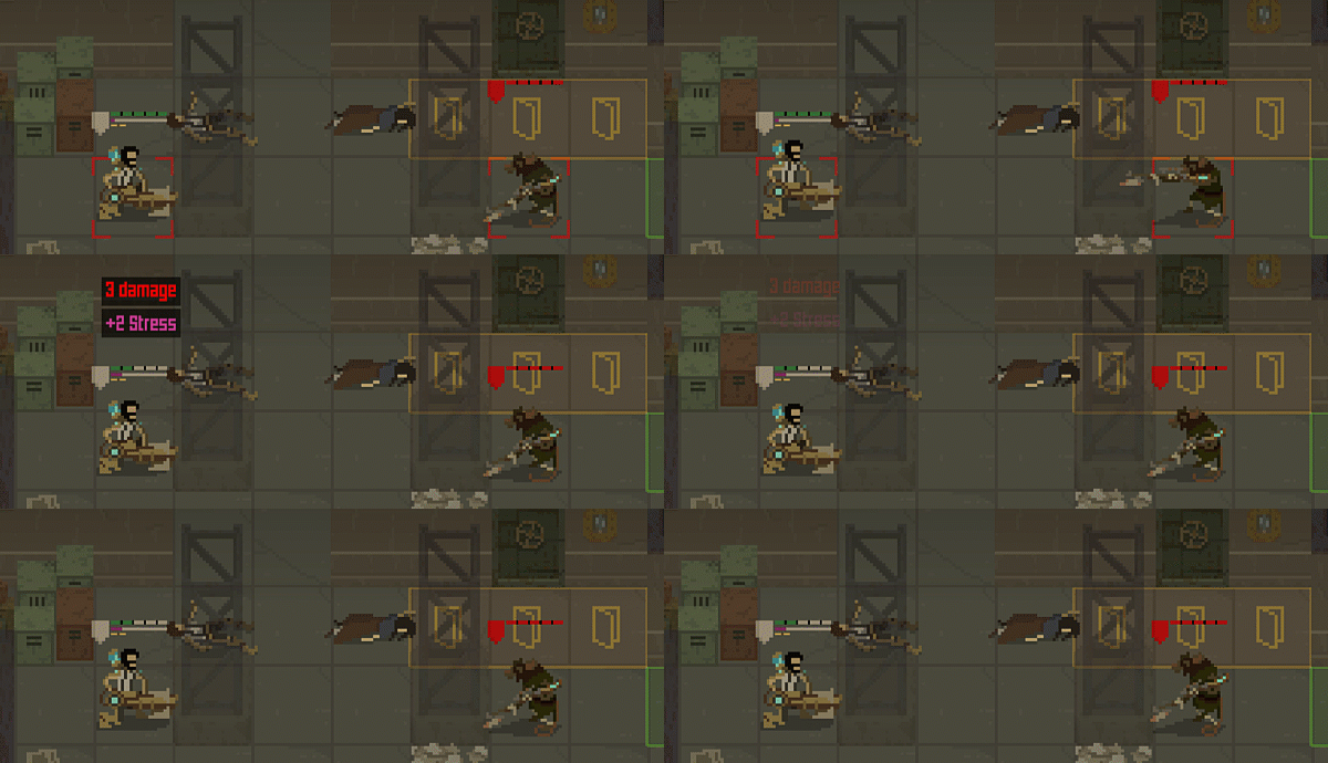
You will need to use every single tool at your disposal: every scrap of metal, fusion core, weapon upgrade, and medical supply to tend to the inevitable injuries. Push through three districts with progressively more vicious enemies, rising emergency levels, and supplies that dry up like blood from a decaying knife wound. Constantly on the move, you’ll search bodies and lockers only to realize that each detour means the Rat Swarm reinforcements are getting closer. The only respite is locked behind bunker doors that can only be opened with the most precious of all finds: the all-powerful fusion core.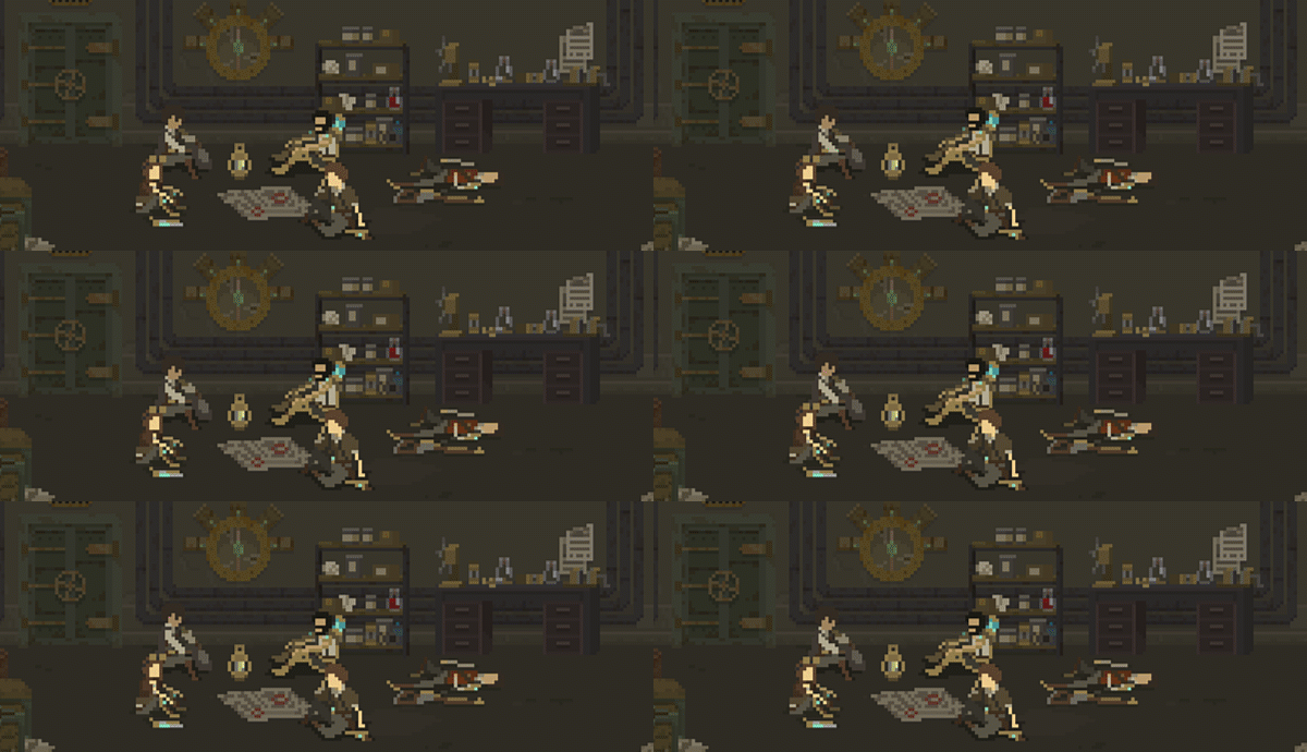
Choose Your Misfortune
How will you deploy your fusion cores? You could use it as a super-powerful explosive to get rid of a five-rat-strong pack, but then you’ll lose the means to open a bunker door that will allow you to tend to injuries and fix up weapons
Blow Off Some Steam
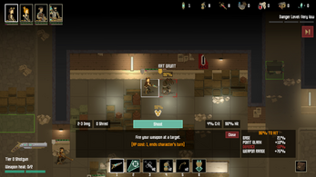
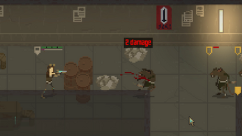
All the guns in Shardpunk are energy-based, and once you get a specific number of shots in, you’ll need to cool it off. However, you can test your luck and attempt a fifth shot on that four-shot cannon. But if it backfires or overcharges, you’ll have to hope that there's still one turn left before that rat sniper gets his bearings
Bunker Dilemmas
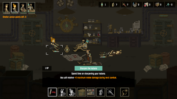
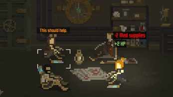
The hiss of the heavy bunker door locking down behind you is only a part of the deal. It's never a matter of “is anyone hurt?” but rather “whose injuries require the most attention?” You’ll rarely be able to heal everyone and save some med kits for later. Who can keep fighting despite their wounds?
Do You Split?
Should you keep all your troops moving at the same pace to find and reach the bunker door in one piece, or split the crew into groups and cover twice as much ground? You can scavenge more loot with the latter strategy, but you’ll risk your smaller squads getting cornered and wiped out by an enemy swarm
Draft A Motley Crew
Shardpunk gives you loads of flexibility in putting together your crew of survivors. For example, you could go with the dependant Mycroft with his exoskeleton, powerful ground slam, and heavy cannon that holds more limited charges, or you could take your chance with Silas, a twice-shooting jerk. Sure, he hates everyone, but has a chance to blast two rats in a round
Pick Your Tree to Climb
Get a few kills in, pick up that experience, and reach a temporary zone to upgrade your skills. Should you invest in a larger area for the katana-wielding close combat, or put your skills in the shotgun spread? It’s yet another choice that will impact your experience
Development log
- Devlog #140: Shardpunk is now live!Apr 13, 2023
- Devlog #139: Less than a week to launch!Apr 07, 2023
- Devlog #138: Release date reveal!Mar 24, 2023
- Devlog #137: Can a game be truly fair?Mar 04, 2023
- Devlog #136: Reflections on Next FestFeb 17, 2023
- Devlog #135: hand-holding tutorialJan 27, 2023
- Devlog #134: shelter phase changesJan 27, 2023
- Devlog #133: 2022 wrap-upDec 31, 2022


Comments
Log in with itch.io to leave a comment.
I dont see the download link on this itch pag
Indeed - the latest demo is available on GOG and Steam,
Oh, you got a publisher and they’re taking care of that.. nice.
The game is awesome. You have something special here. Congratulations!
The only thing that puts me off is rat enemies. I find them too common and not very interesting. Other than that, everything is on the right track.
Yeah, I don't like rats - that why I am making a game about shooting them ;)
Great game, absolutely love it. Beautiful artwork and challenging. Take my money!
Hello there! Seems like hard-core quality title. Good luck with further development.
I love how I saw your game starting out with some rough mockups and screenshots and turning out more and more polishd. Very good progress & serious development!
Good game!
Android version is planned?
Thanks! Nah, I did not consider porting it to mobile - at least not until I finish the PC version, which might take some time ;)
Second TechDemo feedback:
* Smooth screen shake on shooting and hits is well done!
+ Music volume is too high even on lowest setting. Low volume settings should be more detailed, so we have a lot of quiet & quieter settings
+ SEARCH WHERE for MED SUPPLIES should be a crate lit with intense colors, so I see, where on the map should I go for supplies
+ You need to have pixel BLOOD SPURT effects on hit characters. I didn't notice, if you have those, since the entire Battlescape is TOO DARK and Badly Lit!
+ All UI text need to be larger, 2x at least.
+ Characters must be able to move to their destination on LMB!!!
+ Please avoid loud UI sounds ==> current End of Turn SoundFX please decrease volume to 80%. These things need to be SUBTLE
+ Those drums on Enemy Found are party of the music? Disturbingly loud.
+ Shadows under characters are too intense. Reduce them to alpha 0.8 at least. Shadows can currently be mistaken for a soldier lying on the ground
+ SHOOT action should be activated on the red Target rectangle NOT on a separate shoot button. When I want to look for and shoot a target I put the target rectangle on their heads - change with TAB if I want an other target and when I decide to FIRE, then I LMB on the RED RECTANGLE, not somewhere else on screen, where you paced the shoot button..
+ CHARACTER HIGHLIGHTS = All soldier characters should be well lit, there should be an XCOM: UFO DEFENSE PERSONAL LIGHTING on each soldier so we can DIFFERENTIATE them from the background. Check out 3D MAP LIGHTING TUTORIALS on the net, how to do proper map lighting ==> valid for 2D too, to increase visibility on your maps. Basics of Art Direction!! Essentially all your map graphics brightness / contrast should be increased at least 2x to RGB 245:245:245. You should only leave 10 pixel data space 245...255 for Special Effects Highlights, like grenade explosion or gun muzzle flashes you should show, when guns are being fired or soldiers throw a Tactical Light to light up the battlefield or use flash-grenades..
+ All soldier characters need INCREASED CONTRAST +++"PIXEL LIGHT INTENSITY": You have more than enough color intensity RGB space in your current graphics ==> USE IT!!!
+ CURRENT ACTING CHARACTER needs to be High-LighTed!! I can't see, which character is active ATM (I'm in battle)
+ HOME shortcut should immediately CENTER the camera on current acting character.
+ On ENEMY SPOTTED you display a higher intensity red UI element and dark, almost invisible enemy: this should be reversed. You must show a high-contrast, well-lit the enemy for the player to appreciate the threat and visually communicate to the player, how frightening are the monsters and strike fear in the player's heart.
Many thanks for such rich feedback!
Yeah, I did receive info about the sounds being on different levels, with some of them being too loud and others too quiet. I am planning to level them out.
I am a little worried that you did not notice the highlight on the active character, as it is there. It is not very bright, but it is animated to make sure that the player can see it.
Characters did have their "personal lighting" in older game builds. Basically each character model had a light source of their own. However, this looked silly as the models did not have any light sources displayed (no flashlights, etc.). I might revisit this approach in the future.
I did try the LMB movement approach (as several people were asking about it), and it did not work well in the game - I kept on accidentally moving a character when I misclicked an action button. That being said, key bindings will be customizable in the end.
Performing the attack by clicking on the enemy has been reported multiple times, and I am definitely adding it.
You made a good point about the lighting/colors. I do want the game to be dark, on the other hand I don't want it tu suffer from poor contrast. I already started increasing the contrast of some of the map tiles and the results are quite nice.
And thanks for the "tactical lighting" idea! Throwing a flare might increase the % to hit enemies. Or, if we assume that rats are afraid of such artificial lights the player might receive a way to effectively (yet temporarily) block enemy movement.
It seems that you need some classes in Respect. You may never have thought about the fact that the developer is probably learning a lot while making this game and that he has the right to make mistakes, your life is not at stake AND that the game is currently in development so if you explain things in a constructive and polite way the developer will take into account your feedback to improve his game.
You are right And I apologize to the developer.
I was in a bad mood yesterday and obvious design flaws just really tick me off. But that is no excuse. I was being an ass.
I can forgive a dark game because some players like such an atmosphere...that is a design decision, But when it is a web page or something that is meant to be read but hard on the eyes...that is somthing that really gets my goat.
But the game does look very interesting in spite of it being, in my opinion, a little to dark. I tried to download it (It won't download for some reason) to give it a try and see that maybe, when it is actually being played, that it is not too dark, Then I can apologize to the developer and let people know that my initial opinion was wrong.
OK. I was finally able to download the game (funny that the itch.io client app wouldn't download it but I could download it from the itch.io website in my browser)
So I apologize to the developer again. The game is not too darkand it is very professionally done in the gameplay and pixel art. But I would like a bit more contrast between the units and the background.
One thing I would like to see added is an option to turn off mouse pointer edge scroll. The WASD keys are enough.
I deleted my original post because it was inaccurate and misleading for anybody interested in this good game.
Hi - thanks for this.
I am aware that the contrast should be bigger. Now that I am aware how the lighting affects the contrast I will surely be altering the colors, at least for the future tilesets.
About disabling the camera mouse edge movement - I will be putting this as an option into the game.
Thanks for that!
It looks very good. Graphics are nice, especially characters and animations. Sound effects are immersive.
Few things in mind :
Well done on this and good luck for the remaining work. Blasting vermin feels satisfacting !
Thanks for the good words and for the feedback! Also, consider filling out the survey linked in the tech demo!
Hi, could you release it on PC Linux as well ? Thanks
Have you tried running the game on Linux? I made it on Unity and it might be that it will simply be working - I haven't tested it on Linux.
No, the file is an Windows executable, you have to export to Linux and provide a Linux executable, if you are willing to. I could try to run it via WINE, but then it's not native Linux.
I hear you. I uploaded a Linux build, so do check out whether it's working.
Thanks ! It's broken. I can DL and launch the game, then i can access the Credits and Options menu, but clicking Start has no effect at all. No error, nothing, just nothing happens.
Note to all Linux users: we've managed to sort this out thanks to discussions we had on Discord - the Linux version is now available and working.
Best in the demo were:
1. amazing pixel animations
2. fantastic gun sounds
3. Really nice armored soldier movement sound
4. Writing is okay. Meaning in most games the writing is sub-par or worse making the game annoying --> uninstall and leading to Steam Refund. So your writing is okayish.
5. GO-There could be commanded by the LMB
6. Enemies are moving together fast is a BIG PLUS!!
7. Music is nice, a high quality composition.
8. Congratulations to the Family Enterprise! Saw your family in the credits. KUDOS for the achievement: making them work!
As for the objectives I didn't find anything = were massacred by ratmen quickly. You must build in or highlight more the TARGET OBJECT INDICATORS. Where the hell the player is supposed to go should be VISIBLE INTUITIVELY!! Nobody likes to read stupid tooltip-tutorial descriptions.
WHERE ARE THE SPURTING BLOOD PARTICLE EFFECTS??? Warhammer is supposed to be bloody & gory as hell. Make special, gurgling, death animations, make us hear the ratmen spitting blood as the die with miserable groans and their insides spill out onto the ground.
Last to die was the big armored soldier, he was surrounded. He should be using a SAWBLADE / Texas ChainSaw Massacre type weapon for close combat mass kill. Although his GROUND SLAM mass kill was very nice ==> in such cases you must make all the ratmen scream in a gruesome Choir as they perish together. Just like the sectoid group-scream in XCOM: UFO DEFENSE!
Most annoying in this demo were:
1. Loose this eyestgraining light-red. Use yellow or light
purple-blue, anything but this eye-killing red.
2. Street lamps are too bright, causing eyestrain
3. Lose the friggin' red from warning messages and UI
4. End of Turn sound is WAY too loud!!
5. Music is too loud. Use longer slider to refine volume more
6. 'Weapon hot' for Agnes Highmore status doesn't cool down fast??!!
7. Action delay / ending one soldier's turn and auto-switching to the next soldier should be shorter, make it configurable in GAME--OPTIONS = entire combat will be faster.
Thanks for that! I was hoping to receive some feedback on the game - that was the reason why I decided to release the tech demo - and it looks like I got just the stuff I wanted!
Here are my comments to some of your input:
Amazing pixel animations
Thanks! Credit goes to Kurt (https://twitter.com/cKURTain), the freelance artist who was the main UI designer.
Fantastic gun sounds, really nice armored soldier movement sound
This one is mind-blowing - the armored soldier movement sound is the one that I dislike the most :) I guess it's all a matter of taste.
Music is nice, a high quality composition.
I know, right? Credits go to the awesome Jessica Kelly (https://www.jessicakelly.co.uk/)!
GO-There could be commanded by the LMB
I believe it should be configurable. Mutant Year Zero is using LMB, XCOM uses RMB. I spend more time with the latter, that's why I've decided to use it.
'Weapon hot' for Agnes Highmore status doesn't cool down fast??!!
That's an interesting point! The weapon heat mechanism was not supposed to allow auto-cooling at all. Player needs to manually reload the weapon to cool it down. That being said weapon being cooled down by itself seems like a normal thing that should be happening. I will surely be putting more thought in to the cooling mechanism - especially as I want to indroduce some more depth to it.
Congratulations to the Family Enterprise! Saw your family in the credits. KUDOS for the achievement: making them work!
Haha, thanks. That is what family is for, right? ;)
Again, thank you for fantastic feedback - I will surely put it into good use!
This game looks pretty dope. Take your time and do it right, I'm sure this will be a blast when it's good and ready.
Thanks! I will be releasing a tech demo in the nearest future, so make sure you follow the game news on Twitter or on my mailing list to receive updates!
Hi, it looks great. Good pixel art and clean UI, promising. Good luck. !
Thanks for that! It really means a lot to me.