Devlog #52: Revamping the tutorial system
Well I'll be damned! It seems that polishing the game requires far more effort than I anticipated! In my defence I can say I didn't have any experience with it up to this point, so I am learning as I go.
I know that the game is feature complete. However, this does not stop me from expanding the work backlog.
But first things first: there were still directional animations missing, so I created some of them. Rogues now have up/down animations for throwing grenades:
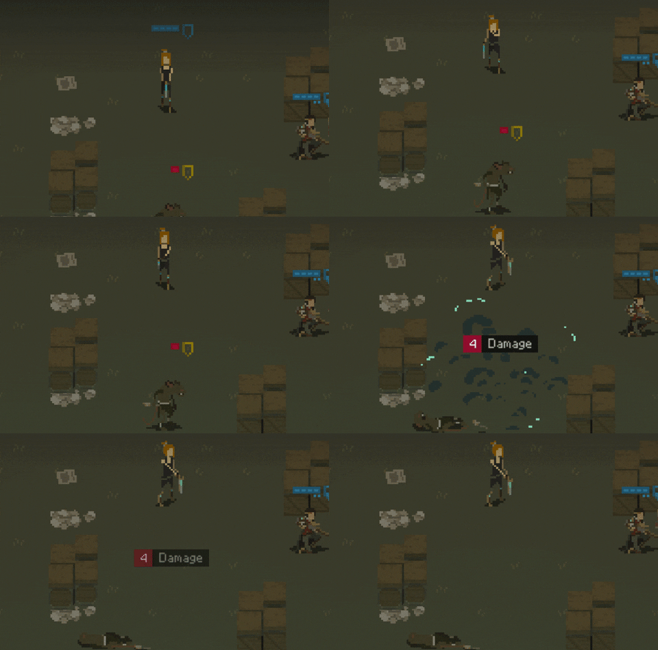
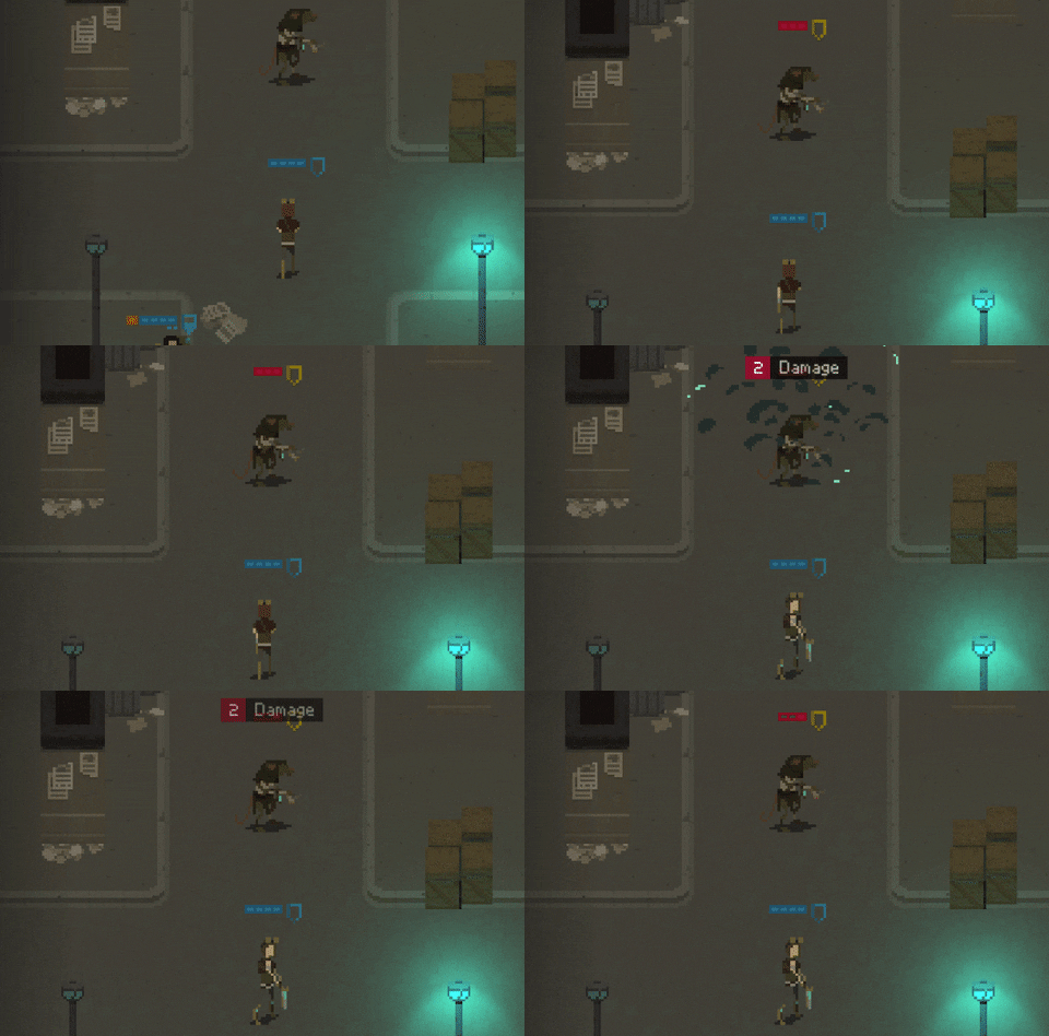
I skipped the diagonal animations for the throwing. Seems like using the default ones work correctly when dealing with diagonal angles:
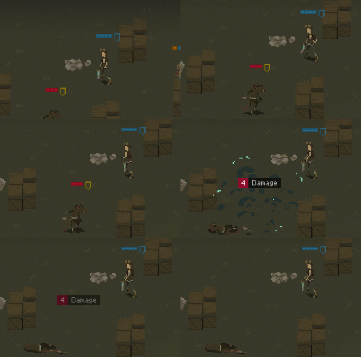
Also, I managed to fix some game bugs during my playtesting sessions. Man, I can't remember when I played something else than my game... good thing is that I am still having fun with it. I guess mostly because each run is slightly different, so this stuff does not get repetitive.
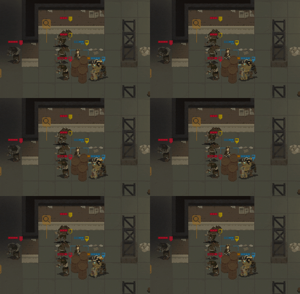
Here's one of the glitches I encountered. Two rats present on the same tile, one of them stuck in an infinite animation loop.
(Now that I think about it, I did play another game recently! It was Crying Suns, and it was amazing. Go check it out, there's a demo available.)
And here's the thing: during playtesting, I found a number of things that I believe need improving. That's why my work backlog keeps on expanding. But hey, I guess that's what the polishing phase is really about.
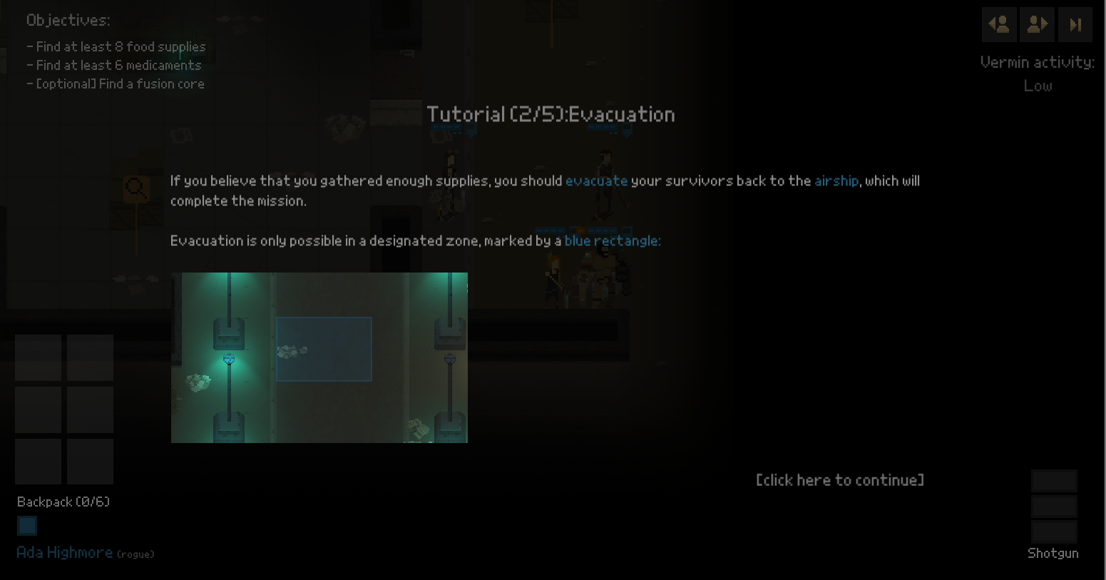
Anyways, even though I didn't plan to to anything about it, I changed the way the tutorial messages are displayed.
Here's the old way of handling them:
And the new one:
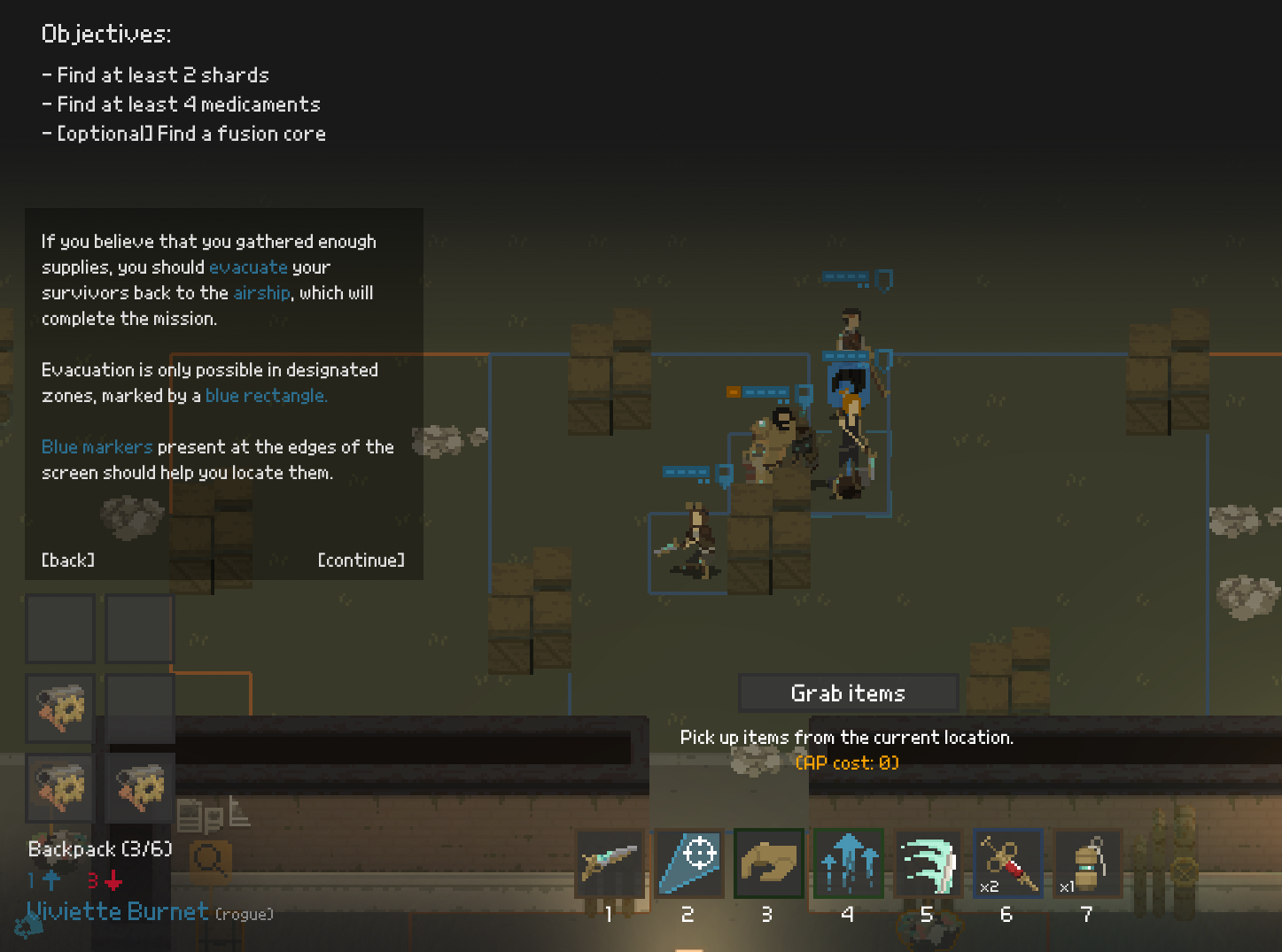
I didn't want the tutorials to take up whole screen space, so I put them on the side. The text has been split into smaller pieces that should be easier to handle by the player.
Hopefully this time I will be happy about the outcome and I won't touch this part of the game anymore.
What's next?
I need to work on the visuals for the loot points. The whole idea of the "scavenge run" demo mission is to search through these points, and I am not really displaying them in any way - they are simply marked by an indicator. Adding some real graphics for it might make the gameplay experience even better.
Thanks for reading!
As usual, if you'd like to receive more frequent updates about the development and a heads-up about release of the demo, follow me on Twitter at @bryquTheDev.
Also, do help me out reaching a bigger audience! Please share, retweet or simply tell others about the game - each new follower gives me a big confidence boost!
Shardpunk: Verminfall
A tactical squad-based survival strategy game based in a thoroughly stylised pixel-perfect steampunk setting.
More posts
- Devlog #140: Shardpunk is now live!Apr 13, 2023
- Devlog #139: Less than a week to launch!Apr 07, 2023
- Devlog #138: Release date reveal!Mar 24, 2023
- Devlog #137: Can a game be truly fair?Mar 04, 2023
- Devlog #136: Reflections on Next FestFeb 17, 2023
- Devlog #135: hand-holding tutorialJan 27, 2023
- Devlog #134: shelter phase changesJan 27, 2023
- Devlog #133: 2022 wrap-upDec 31, 2022
- Devlog #132: playtests in progressNov 25, 2022
- Devlog #131: combat tactics, and moreNov 12, 2022
Leave a comment
Log in with itch.io to leave a comment.