Devlog #53: Corpses and loot
Welcome back! This has been a very interesting week, as I focused on tweaking some in-game visuals. As I mentioned previously I wanted to do something about the way loot points are displayed.
The tech demo that I am working on will have a single mission available, and it will be about scavenging resources. Gameplay-wise, there are some searchable loot points present on the map. The player should search through as many of these as possible to find sufficient stuff to keep the game going: people need to be fed and healed, the airship needs to have fuel, explosives need to be made, etc. etc.
The bottom line is that the player needs to prioritize searching through these loot points above doing anything else. Even combat is secondary. That being said, if you don't deal with the rats they will deal with you, and all your precious loot will be gone anyway.
Until this point, the loot points were displayed using a yellow indicator. The indicator itself is a good idea (as it gives the player information where they need to go), but it was lacking "real" visual representation:
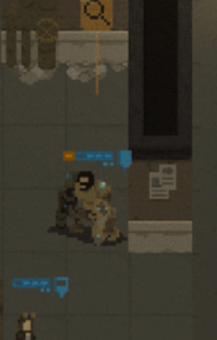
That's why I've added some visuals, for example a suitcase and a metal container:
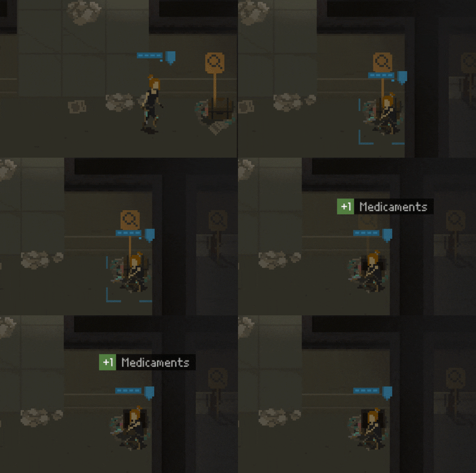
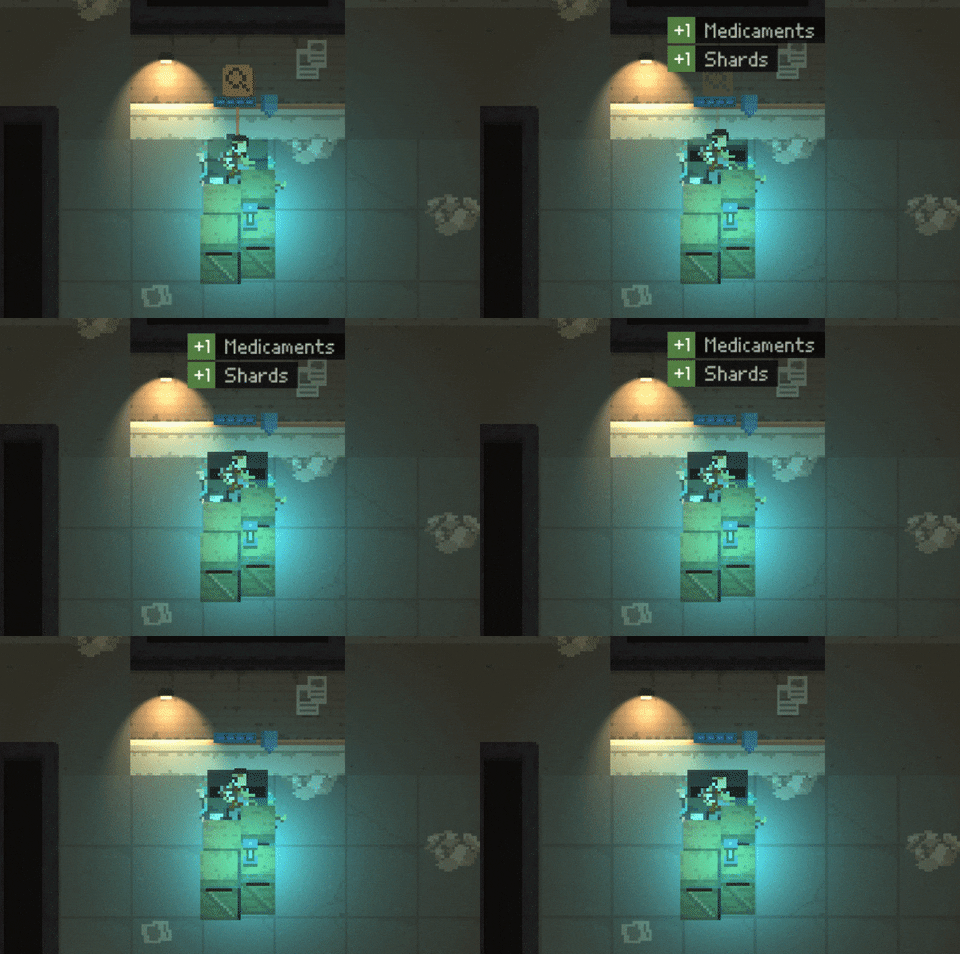
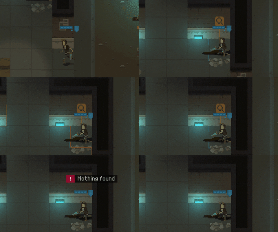
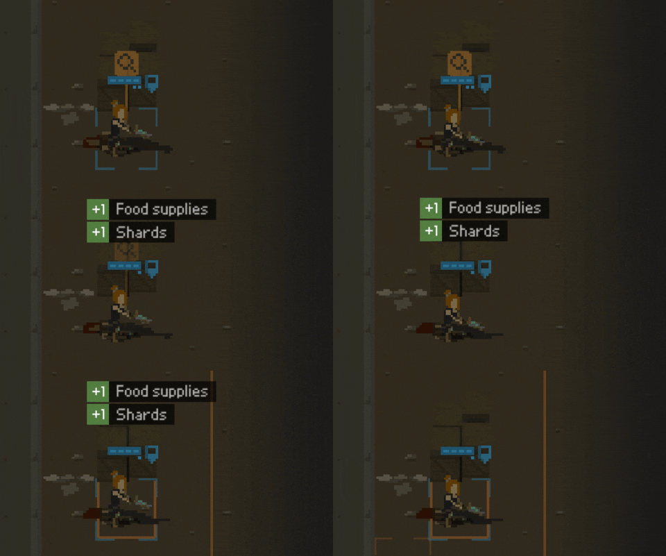
Also, I figured out that it would be cool to add some dead bodies to the game. After all, the Capitol has been overrun by the rat swarm, so there should be some signs of a massacre on the streets, right? And as bodies seem like great material for loot points as well, I made them searchable:
An interesting thing came up when I was adding yet another loot point: a locker.
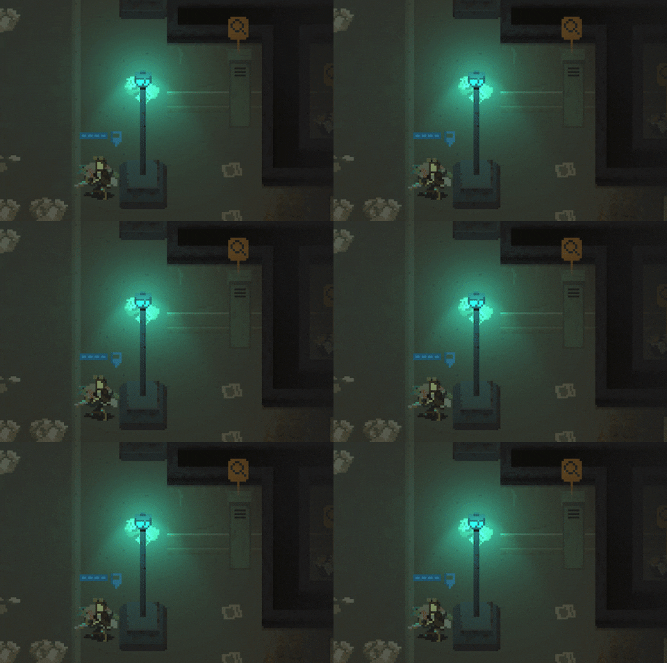
The thing with the locker is that it is higher than other loot points. Therefore, because the orange loot indicator graphic is independent from the loot point graphic, they were not looking too good together:
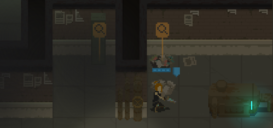
As you can see, the loot indicator covered up the locker almost entirely.
What is more, it made no sense for the player characters to crouch when looting a locker (which is happening for all other loot types). There's no need to crouch when you're opening something that high.
In the end, I made sure that each loot point visual has some metadata, and its size (being large or small) is a part of it. The position of the orange indicator depends on the size.
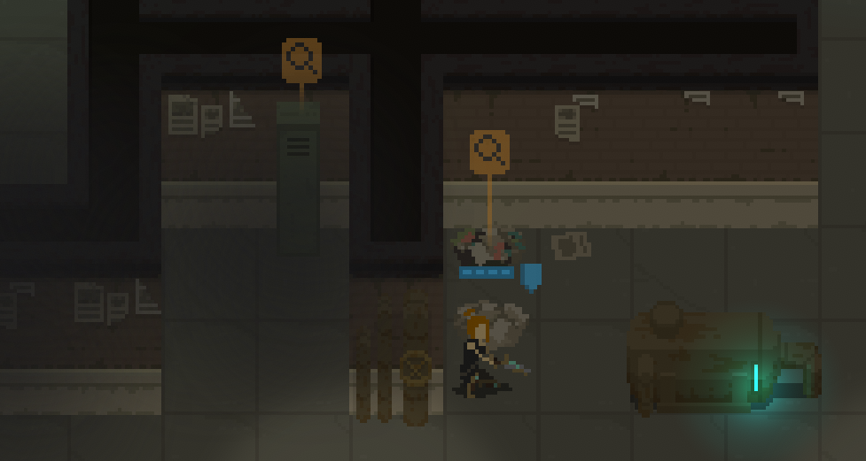
With the new approach, loot indicators can be different for different loot point types.
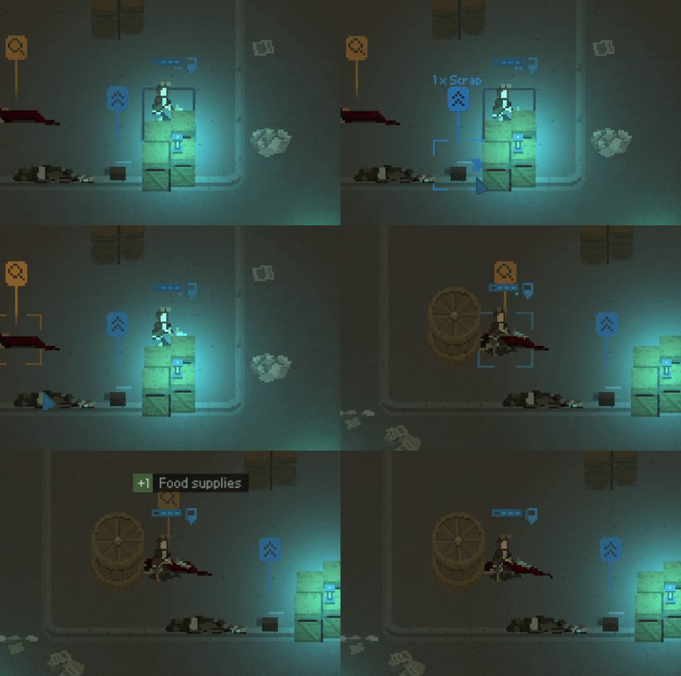
Additionally, when characters drop their inventory on the ground, there's now a clear information on what has been dropped:
What's next?
Well, I will go bug-hunting again! This means a lot of gameplay sessions and tweaking the numbers. I already changed my approach twice to the number of hit points the enemies should have, to the number of loot points appearing on a map or to the way the camera works.
I definitely need to get this game demo out and receive some real external feedback. I will start by having a small, closed demo for a few people that were involved in the game creation process. Then, after the game logo and Steam page are ready, I will release the tech demo to the public.
Thanks for reading!
As usual, if you'd like to receive more frequent updates about the development and a heads-up about the release of the demo, follow me on Twitter at @bryquTheDev.
Also, do help me out reaching a bigger audience! Please share, retweet or simply tell others about the game - each new follower gives me a big confidence boost!
Take care!
Shardpunk: Verminfall
A tactical squad-based survival strategy game based in a thoroughly stylised pixel-perfect steampunk setting.
More posts
- Devlog #140: Shardpunk is now live!Apr 13, 2023
- Devlog #139: Less than a week to launch!Apr 07, 2023
- Devlog #138: Release date reveal!Mar 24, 2023
- Devlog #137: Can a game be truly fair?Mar 04, 2023
- Devlog #136: Reflections on Next FestFeb 17, 2023
- Devlog #135: hand-holding tutorialJan 27, 2023
- Devlog #134: shelter phase changesJan 27, 2023
- Devlog #133: 2022 wrap-upDec 31, 2022
- Devlog #132: playtests in progressNov 25, 2022
- Devlog #131: combat tactics, and moreNov 12, 2022
Leave a comment
Log in with itch.io to leave a comment.