Devlog #71: making top walls more transparent
Ugh, so apparently I am not very good at reading dates. Digital Dragons submission deadline is the 1st of July. I mean I did get it correctly in my previous post, but I've mistaken July with June, resulting in me thinking that I have one month less time available 0_o.
So, now that I realized I have some spare time left, I decided to tweak one additional thing in the combat phase: the top walls.
I did mention it in one of my previous posts. Some of the testers were complaining that they cannot see enough of the floor hidden behind the wall if the wall is 2 or more tiles thick:
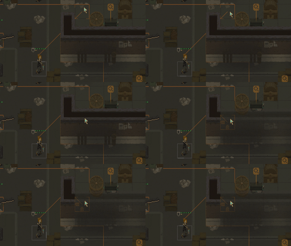
Here all is good. The player is able to see the whole tile behind the wall.
Here, however, we see that half of the tile is still hidden behind the top wall.
Now, the problem was caused by the way I was approaching top walls rendering. I was rendering them using a set of predefined sprites for each possible combination:
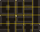
I've added some rough lines to make it more obvious where a tile starts.
Then, based on the neighbors of the tile, I was rendering the correct one. This worked good, except for situations in which a thick wall would be present:
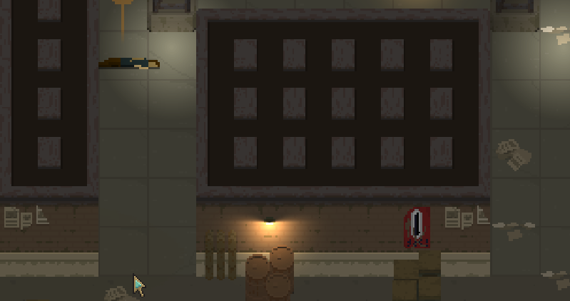
Solving this would require to add even more predefined top wall tiles (to include all the combinations for thick walls, inner corners, etc. etc.). So as a workaround, I started covering these unwanted edges with dark rectangles:
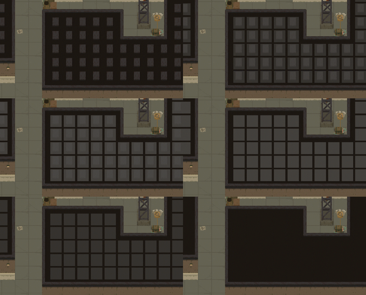
So this approach worked well - no excessive top wall borders were being shown. However this was causing the initial issue of thick top walls not being fully transparent; I simply could not make them transparent, as there were these helper rectangles along the way that would expose the parts they were hiding.
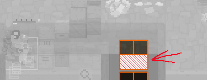
The striped rectangles could not be made transparent as they'd reveal the excessive borders they were supposed to hide.
So I finally decided to drop this approach and try another one. I made sure that the inner sprite and the borders are physically separated. The border is being rendered on top of the inner sprite:
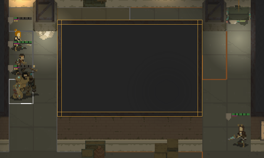
This approach allowed me to reduce the number of border sprites. Technically only three types are necessary: vertical, horizontal, and "corner" ones.
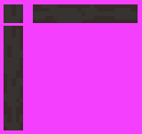
This could be extended - to improve the visuals - with introducing "front" and "rear" horizontal edges, and maybe some more variants. But these three sprites are all that is required to make this work.
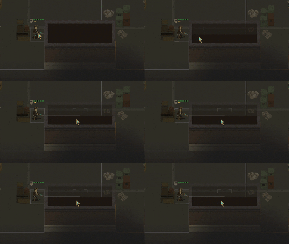
Anyways, with the new approach I am able to hide as much of the top walls as I want to!
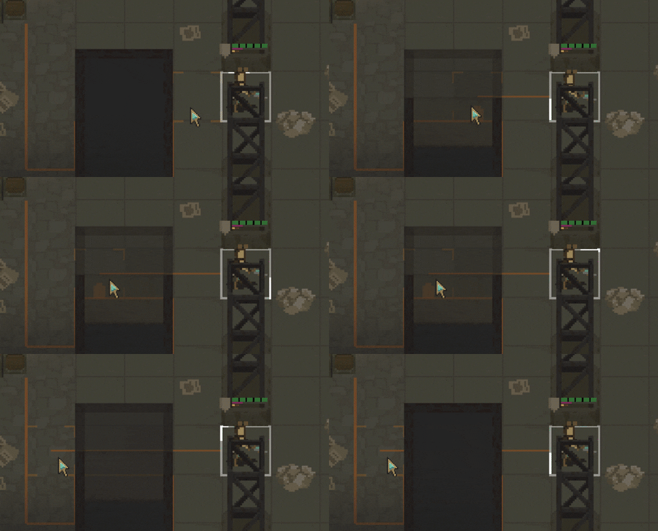
Boom! A thick wall is transparent! I see this as an absolute win!
That's all for this entry. Take care!
Shardpunk: Verminfall
A tactical squad-based survival strategy game based in a thoroughly stylised pixel-perfect steampunk setting.
More posts
- Devlog #140: Shardpunk is now live!Apr 13, 2023
- Devlog #139: Less than a week to launch!Apr 07, 2023
- Devlog #138: Release date reveal!Mar 24, 2023
- Devlog #137: Can a game be truly fair?Mar 04, 2023
- Devlog #136: Reflections on Next FestFeb 17, 2023
- Devlog #135: hand-holding tutorialJan 27, 2023
- Devlog #134: shelter phase changesJan 27, 2023
- Devlog #133: 2022 wrap-upDec 31, 2022
- Devlog #132: playtests in progressNov 25, 2022
- Devlog #131: combat tactics, and moreNov 12, 2022
Comments
Log in with itch.io to leave a comment.
Well done, nice improvment ^^
Noice :)