Devlog #74: fleshing out the next alpha demo
Wow, it seems it's already been two years since I started working on the game! I can't believe how fast the time goes.
I believe I have to start doing more planning when it comes to creating Shardpunk. Sooner or later I will need to have a rough answer on how much time I need to finish the game (or at least to reach a state in which Shardpunk would qualify as an Early Access title that people would be willing to pay for).
So I started tracking the time I am spending on development. Right now (after 17 days since I started it) I am spending 2 hours a day on average. This gives a whopping 14 hours a week, which is not that bad for a hobby project! Still, working full time would be better, right?
Note that this time includes not only programming but things like playtesting, gif creation or writing blog posts (it took me around an hour to write and publish this entry, including the time spent on creating all the screenshots and gifs).
Anyways, I am busy working on the next demo. Seems I don't have any external deadline as there are no competitions taking place (all canceled or moved) - which is a pity, as it would be a great opportunity to showcase my game and see the players react to the game.
On the other hand, I received lots of great feedback from the online survey and I am pretty sure I will gain even more after the 3rd alpha demo is released.
Anyway, here are some things I worked on during the last two weeks. You will see they were all around the place, as I am trying to put all the pieces together.
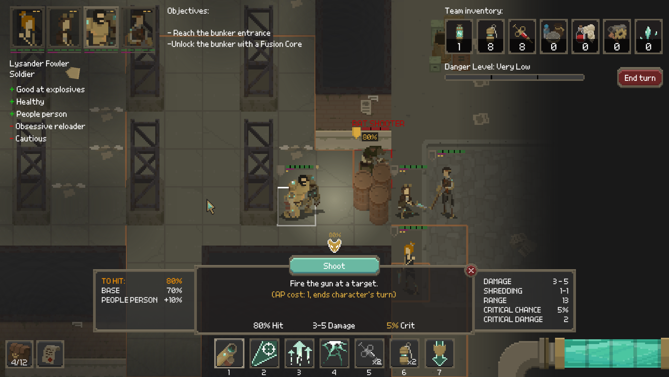
I changed the combat UI so that it displays the global inventory in the top-right, just like in the shelter view. The "global inventory" is basically a sum of inventories of all alive characters. Seeing it in combat allows you to quickly see how many resources you have at your disposal so you know what you're missing.
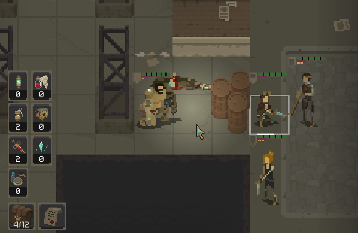
I've also made sure that the inventory of each character has a similar way of displaying items.
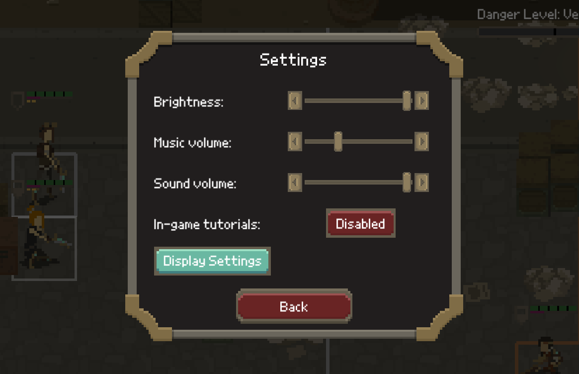
Speaking of the UI, the settings menus now have some real graphics:
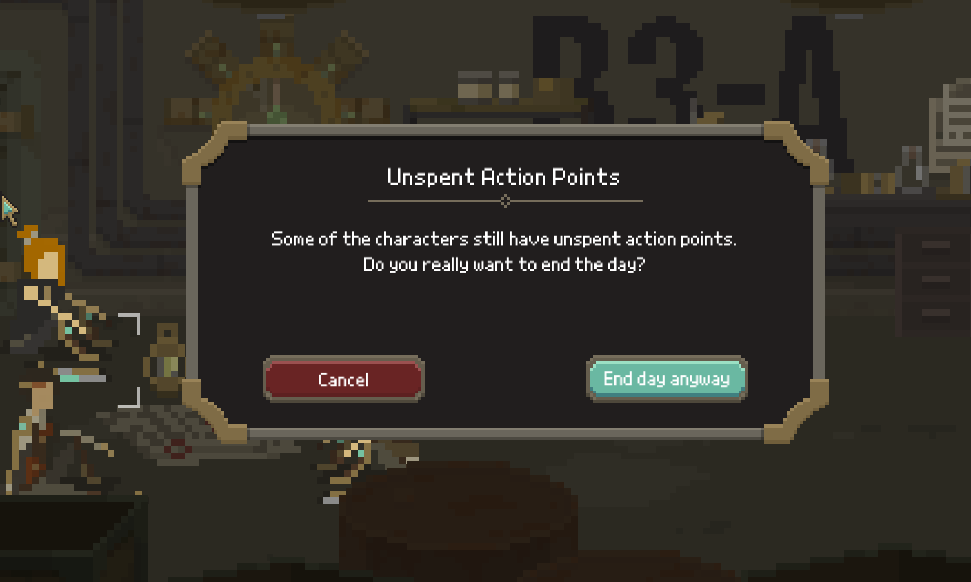
Same goes with some yes/no dialogues:
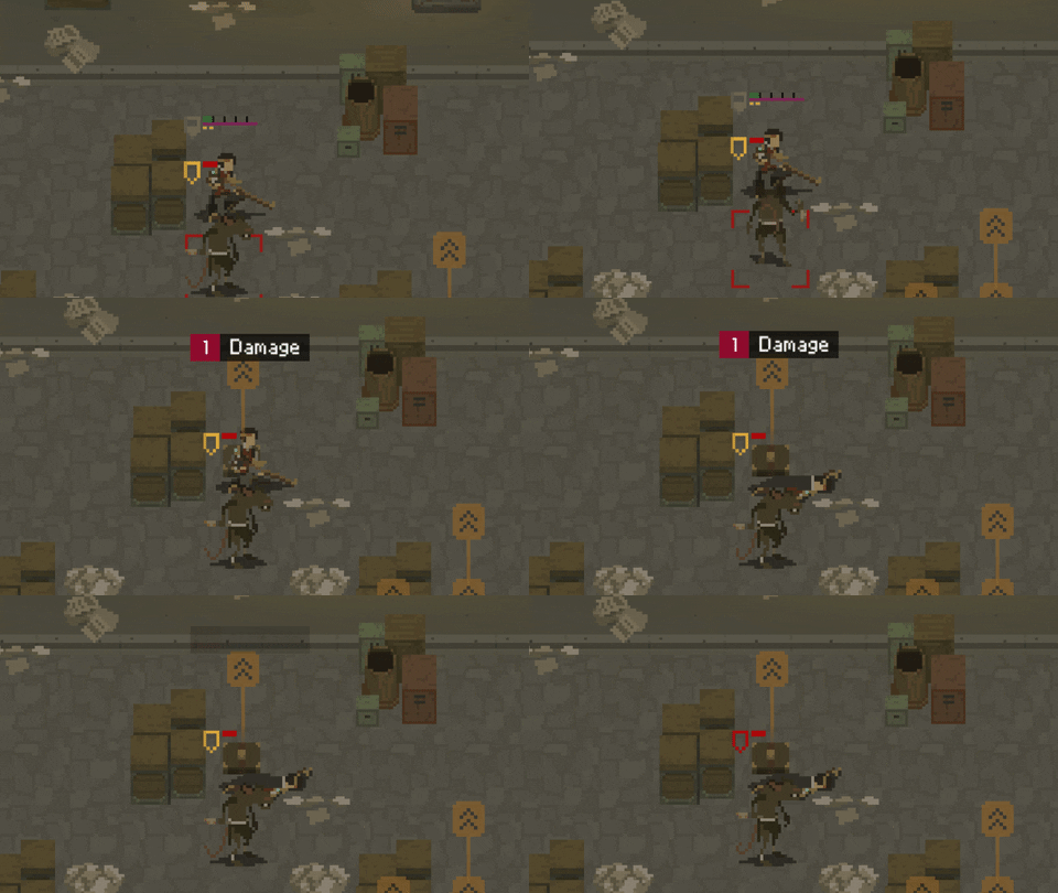
In combat, player characters now have an alternate death animation which is used when they're standing next to cover; this prevents them from flying through walls or obstacles.
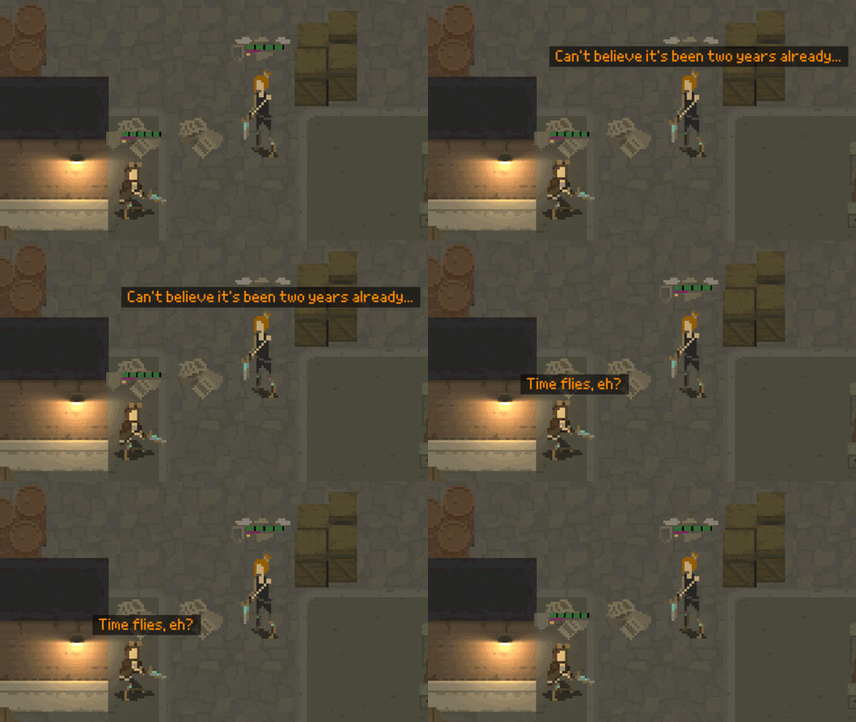
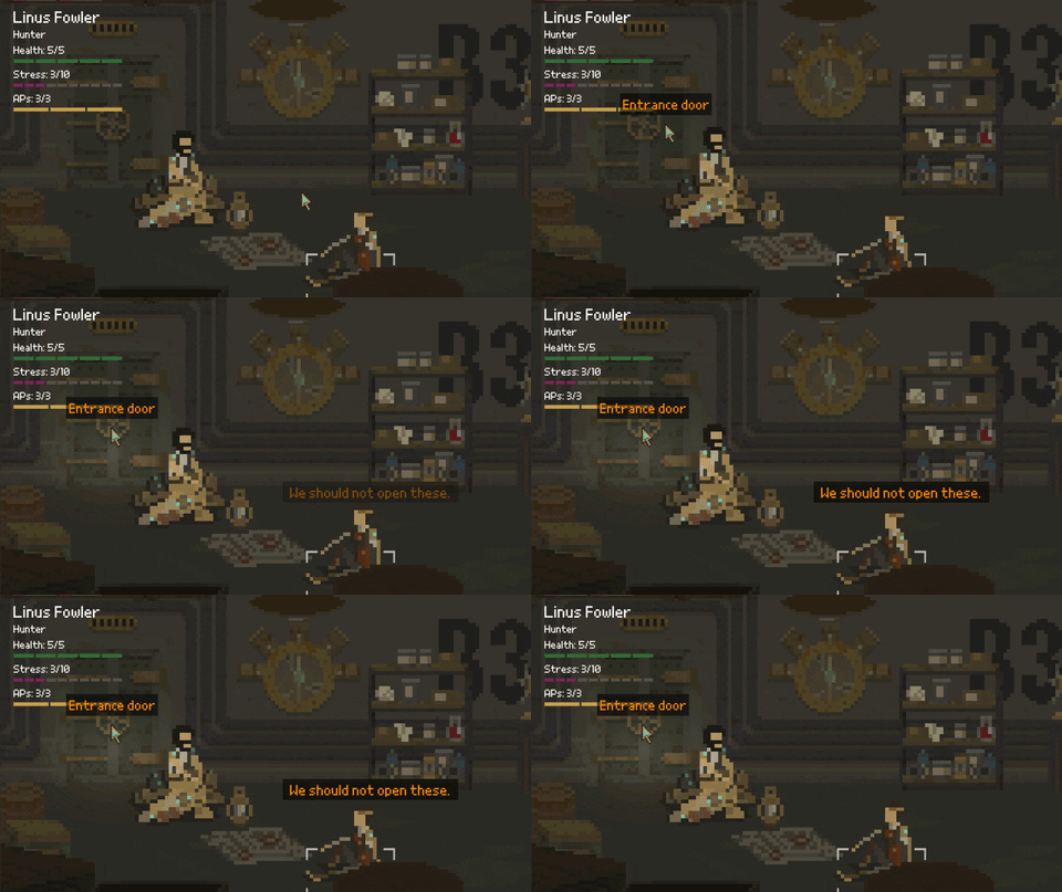
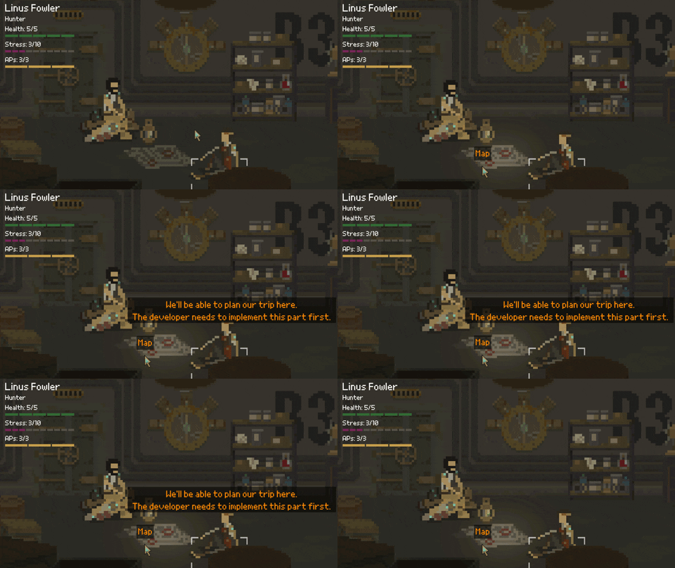
As for the shelter view, I added some minor non-essential elements that the player can click to see a short dialogue. This does not influence the gameplay in any way, but adds a nice flavor:
So what's next?
Well, the gameplay loop is now working. The game has a failure state, and there's a 2nd "mission" after you spend the night and exit the shelter. Well, the mission will be extremely short, just to give a hint of how the game will play out.
I still need to polish a few things. Also, I want to add more variety to the combat levels; I am waiting for some new graphics for this. Hopefully, I'll be able to showcase these in two weeks.
Take care!
Shardpunk: Verminfall
A tactical squad-based survival strategy game based in a thoroughly stylised pixel-perfect steampunk setting.
More posts
- Devlog #140: Shardpunk is now live!Apr 13, 2023
- Devlog #139: Less than a week to launch!Apr 07, 2023
- Devlog #138: Release date reveal!Mar 24, 2023
- Devlog #137: Can a game be truly fair?Mar 04, 2023
- Devlog #136: Reflections on Next FestFeb 17, 2023
- Devlog #135: hand-holding tutorialJan 27, 2023
- Devlog #134: shelter phase changesJan 27, 2023
- Devlog #133: 2022 wrap-upDec 31, 2022
- Devlog #132: playtests in progressNov 25, 2022
- Devlog #131: combat tactics, and moreNov 12, 2022
Comments
Log in with itch.io to leave a comment.
Sounds good, lovely to see it coming along. Looking forward to trying out the new Linux demo :)