Devlog #84: Map travel
Two weeks have passed; the show must go on. Here's the latest update on how things are going.
I took unpaid monthly leave in my day job for the whole of November. The goal was to see how fast I'll be able to progress with the game when working full-time hours; I needed this data to create reasonable estimates for creating Shardpunk.
You can imagine that I was pretty excited for November! And then, on November the 1st, my Mom died of COVID. This sucks, a lot.
Most of my full-time November enthusiasm was quickly gone. Still, I managed to work on Shardpunk - I had no day job anyway - and I have to say that I've seen a gigantic development speed bust when compared to my previous, "hobby" working hours. I mean it's a no-brainer - I literally am treating gamedev as a day job until the end of November.
Man, it might be difficult to go back to my old day job afterward - although I do love it as well.
Anyway, I managed to develop some new in-game systems, although most of them are not ready to be presented due to missing graphics. I decided to focus on this particular screenshot instead, as it is carrying lots of information about the progress: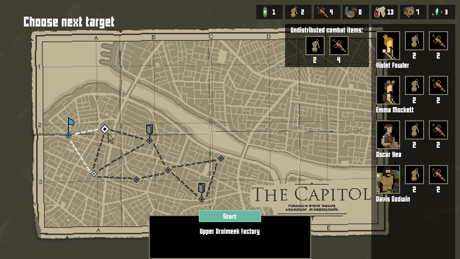
Here's what we got here:
Map travel
This one is pretty obvious, as you can see the map. The player can select the next travel target which starts up a new mission. Map locations may come in different environment types (sewers, open/closed industrial locations). I am planning on adding map modifiers as well, which will increase the variety of levels.
What is more, you can see that only a limited number of locations has a shelter (the ones with a door icon) - it means that shelters will become more scarce. I am still playtesting how this change affects the general experience (as some actions - like curing Stress - were only available in Shelters, so more tweaks might be necessary).
Reduced inventory management
Initially (well, it is still present in v0.3) each character had an “inventory” with a max capacity. They could fit all different kinds of items there. There were two major issues with this approach:
1. The overburdened mechanics. If a character was carrying too much, they would be unable to move. The player had to shuffle the inventory - by dropping some unused items on the floor, and them passing them to another character. That was cumbersome and unnecessary.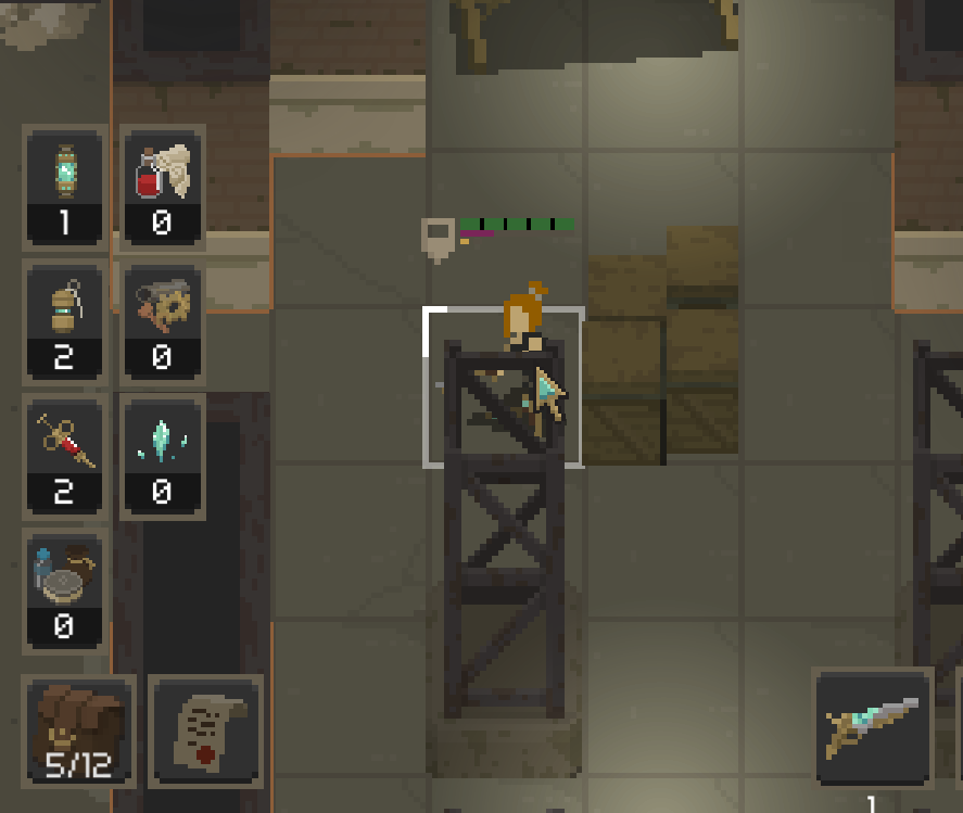
2. Combat preparation screen was huge and it was another unnecessary thing. The player had to distribute the inventory between characters (as you cannot leave stuff in the shelter) before leaving the shelter, which simply resulted in distributing the stuff evenly anyway. It was an unnecessary chore: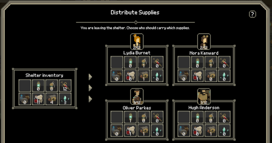
Note that this screenshot only has 4 characters displayed. Imagine how cluttered the UI might get with 5 characters.
I decided to sacrifice some realism to make the gameplay more fluent: right now, only stuff usable during combat is a part of the character's inventory (so stimpaks and grenades). Other things became a part of a common inventory.
What is more, I removed the overburden mechanism. There is no limit of how many combat-related items can a character have. If you want to overuse grenades, you will be facing more enemies. If you abuse stimpaks, your stress will go up.
I've also merged the mission loadout screen with the map screen - which can be seen on the first screenshot.
New UI
The content of the UI was constantly changing, due to new features being added or old ones being altered/removed. This was resulting in the in-progress UI not looking very good - I was just putting stuff randomly, knowing that it is not possible to set up the final layout until all the features are there.
However, ugly temporary UI was reducing my morale, so I decided to create more simplistic one. Something inspired by the office applications I am working on in my spare time, but also by games like Star Renegades, Crying Suns or the upcoming Death Trash. They all are combining pixel art in-game graphics with higher-res (or simplistic) UI:


I ended up with the current simple UI and I am starting to like it. Here's how it looks in combat: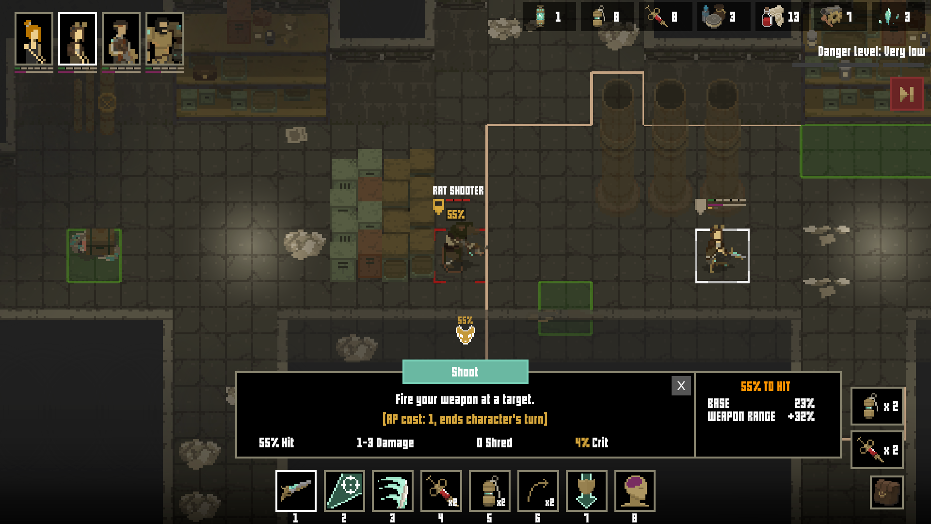
Weapons and add-ons
OK, this one cannot be seen on that initial map travel screenshot. However, I spent a lot of time developing this, so here's a glimpse of this new feature:
It will be possible to find weapons during your missions. Weapons will vary in stats, and will have upgrade slots that will allow you to adjust them even further. Still, character "classes" will be only limited to a certain weapon type.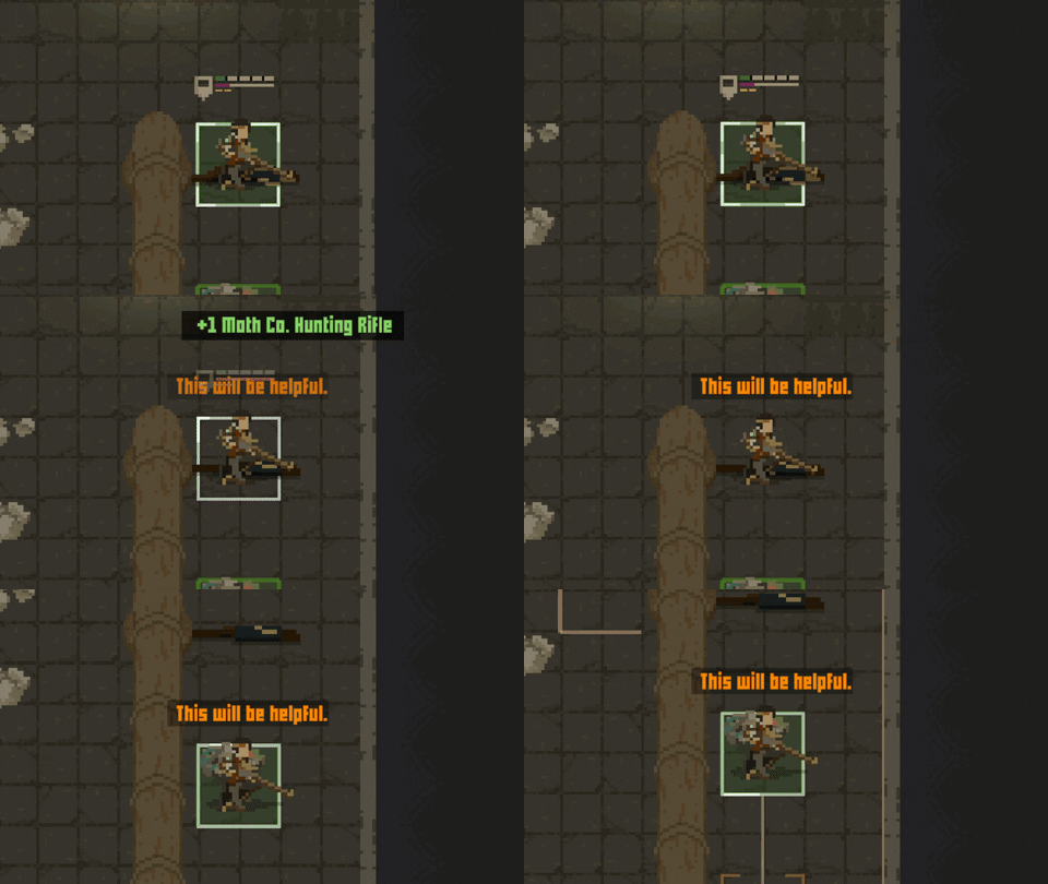
Now, this feature will be a challenge as I want to visualize every different weapon model during combat. I already see a lot of fun in mechanic though - I believe it will be worth the effort!
That's it for this entry. The next one will appear in December, so after I'm back to my day job.
Shardpunk: Verminfall
A tactical squad-based survival strategy game based in a thoroughly stylised pixel-perfect steampunk setting.
More posts
- Devlog #140: Shardpunk is now live!Apr 13, 2023
- Devlog #139: Less than a week to launch!Apr 07, 2023
- Devlog #138: Release date reveal!Mar 24, 2023
- Devlog #137: Can a game be truly fair?Mar 04, 2023
- Devlog #136: Reflections on Next FestFeb 17, 2023
- Devlog #135: hand-holding tutorialJan 27, 2023
- Devlog #134: shelter phase changesJan 27, 2023
- Devlog #133: 2022 wrap-upDec 31, 2022
- Devlog #132: playtests in progressNov 25, 2022
- Devlog #131: combat tactics, and moreNov 12, 2022
Leave a comment
Log in with itch.io to leave a comment.