Devlog #112: More colors, more variety
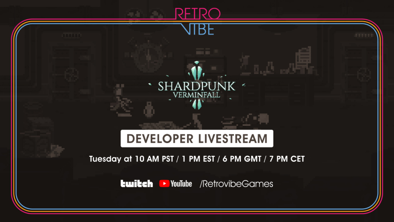
Before we get started, here's an invitation: I'm gonna be doing some live streaming on Tuesday, February the 1st:
I'll be covering all the changes I've implemented in Shardpunk in the last few monthts. Do jump in if you want to get some insight on this stuff, ask some questions or just hang out with a cool game developer 
Now, back to the devlog entry.
I've probably already mentioned that recently I'm spending some time adjusting the visuals of the game - and even though I am not done with this part, there's something I already want to share.
One of the issues I had with the game was that gifs/screenshots were often looking too similar.
Take a look at these two gifs:

They are representing different level types. The top one is located in the "industrial streets" level type, and the bottom one is located in the sewers.
Now, you can see that they are kinda different, but it's far from what could be achieved here.
The main problem here was that there were no "theme" colors assigned to each of the level types. As for now, there are the following level types in Shardpunk:
a) industrial streets,
b) sewers,
c) industrial buildings,
d) caves/mines.
By using different theme colors with every level type, we've achieved a nice variety. So:
Industrial streets are now warmer, with red bricks and yellow light sources:
Sewers have the greenish vibe going on:
Industrial buildings have a colder, more sterile look:
(how could she not land that shot?)
Caves have that blue glow from the crystal shards:
Combination of post-process effects and some fiddlling with lights and color palletes did the job. There will be still some adjustments being made, but in general I believe the level types have become visually distinct.
That's it for this entry. I hope you enjoyed it! And don't forget to check out the Discord server!
Take care, and we'll see each other on the stream!
Shardpunk: Verminfall
A tactical squad-based survival strategy game based in a thoroughly stylised pixel-perfect steampunk setting.
More posts
- Devlog #140: Shardpunk is now live!Apr 13, 2023
- Devlog #139: Less than a week to launch!Apr 07, 2023
- Devlog #138: Release date reveal!Mar 24, 2023
- Devlog #137: Can a game be truly fair?Mar 04, 2023
- Devlog #136: Reflections on Next FestFeb 17, 2023
- Devlog #135: hand-holding tutorialJan 27, 2023
- Devlog #134: shelter phase changesJan 27, 2023
- Devlog #133: 2022 wrap-upDec 31, 2022
- Devlog #132: playtests in progressNov 25, 2022
- Devlog #131: combat tactics, and moreNov 12, 2022
Leave a comment
Log in with itch.io to leave a comment.