New weapon and visuals
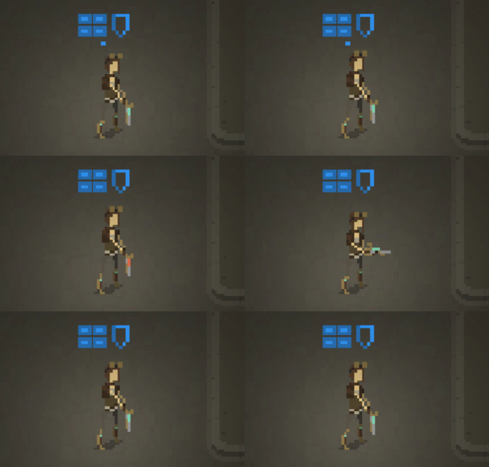
Aaaah, so the holiday break is finally over! I wasn't able to focus much on the game, asn one needs a break sometimes. You do want to keep your sanity in check and spend some time with family, right? Nevertheless, there was progress. First of all, some new graphics arrived from Kurt, meaning that I will be able to incorporate them into the game. Along with these new graphics, a change was made to the rogue character class - she is no longer wielding a pistol, but a shotgun:

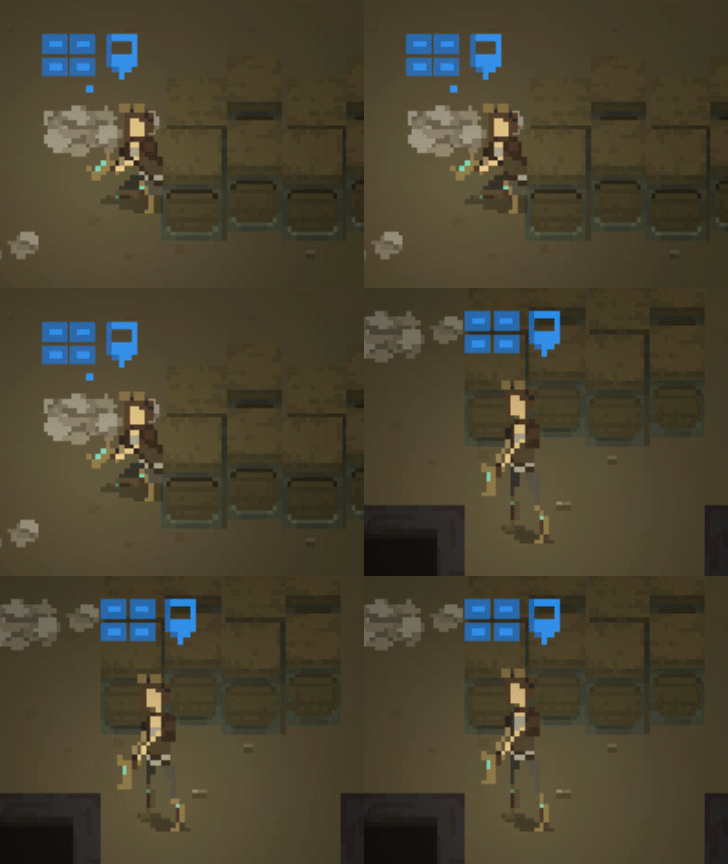
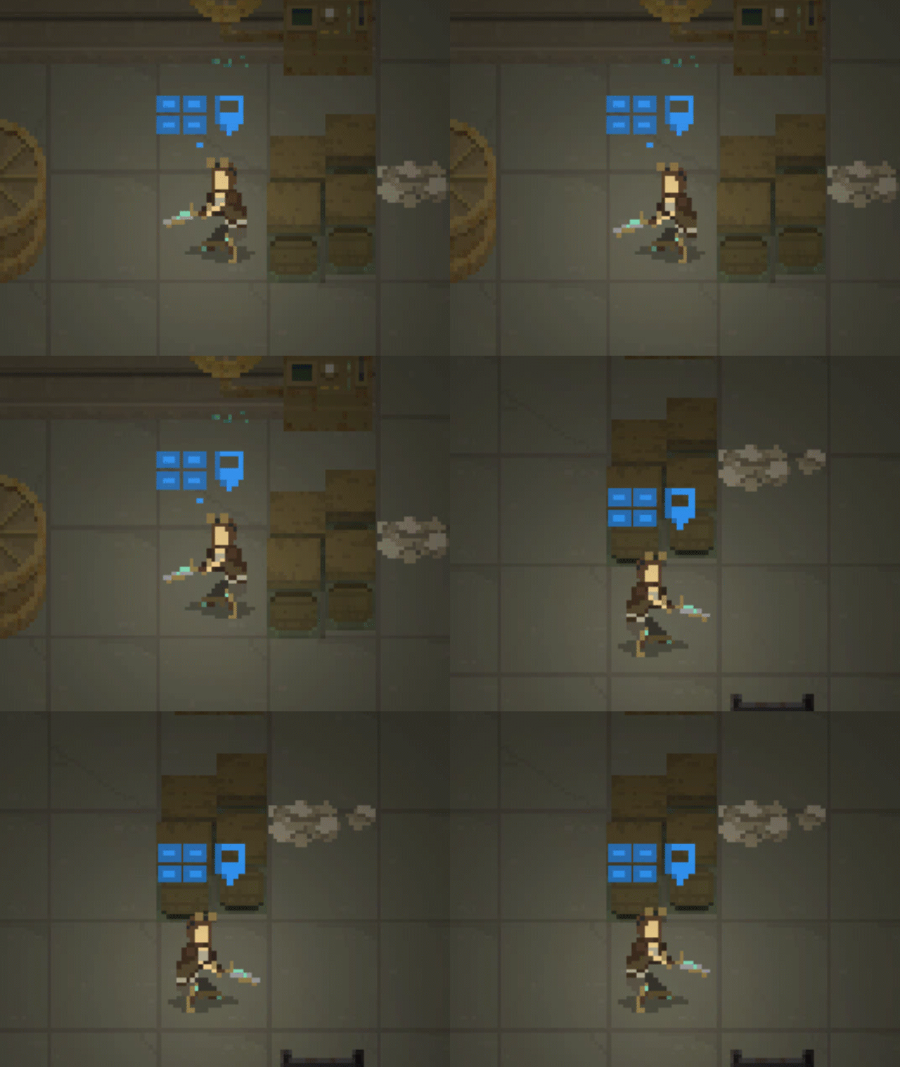
The reason behind it was as follows: rogue character should be strong in close range combat; players should want to take risk with moving her closer to enemies in order to eliminate them in a single shot. Now, it was possible when she was using the melee sword attack. However, the pistol that she was holding was not looking as a huge damage dealer. Therefore we have a shotgun. And yes, I know that xcom's ranger class works very similar (at least in xcom 2). It just seems that this gameplay mechanic makes the most sense if you implement it that way. I need to re-think my class names, I guess. Other character classes will have more profession-like names (ranger, mechanic, medic). So "rogue" seems to stand out. Improved crouching So if a character is hidden behind a low cover, they crouch and have their back touching the cover itself. This turned out to look bad if the character was above/below the cover, so I was simply displaying the "standing" animation that was not really the correct one.

After some changes, the crouching animation looks good on each side of the cover: 
Aside from that, I started to work on the main menu screen and making sure that loading of game resources is more clean. There's always that dirty work that has to be done.
Shardpunk: Verminfall
A tactical squad-based survival strategy game based in a thoroughly stylised pixel-perfect steampunk setting.
More posts
- Devlog #140: Shardpunk is now live!Apr 13, 2023
- Devlog #139: Less than a week to launch!Apr 07, 2023
- Devlog #138: Release date reveal!Mar 24, 2023
- Devlog #137: Can a game be truly fair?Mar 04, 2023
- Devlog #136: Reflections on Next FestFeb 17, 2023
- Devlog #135: hand-holding tutorialJan 27, 2023
- Devlog #134: shelter phase changesJan 27, 2023
- Devlog #133: 2022 wrap-upDec 31, 2022
- Devlog #132: playtests in progressNov 25, 2022
- Devlog #131: combat tactics, and moreNov 12, 2022
Leave a comment
Log in with itch.io to leave a comment.