New map, lighting and models
So I told myself that this week will be about creating a new map and experimenting with lighting. And it turned out that it was exactly what I was doing :)
New map
During playtesting I figured out that the game looks nicer if the combat is oriented horizontally rather than vertically - meaning that the enemies are coming from the left/right instead of top/bottom sides. The player simply needs to zoom out quite a lot if the enemies are far above/below them:
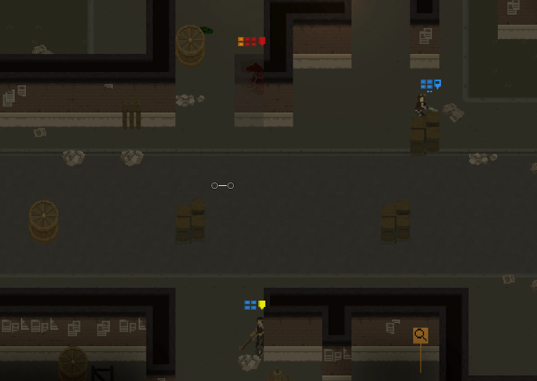
Obviously, as the game plays on a tile-based map, enemies can come from all directions - however, I can control it by creating a map layout that encourages horizontal movement.
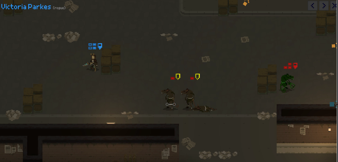
There is no way for the player to move too much up/down here nor spot enemies that are above/below them - due to the walls blocking the view. Of course there is still enough space for the player to consider flanking the enemies if necessary.
Lights
So until now the only light sources on a map were characters themselves:
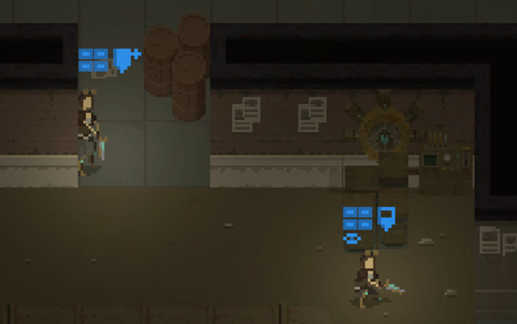
Such approach was better than having no lights on the scene, but was far from perfect - so I decided to remove the character light sources, and start putting lights on random places of a map; that included a flickering light on that 'generator' asset that is currently serving only as a map decoration. And it turned out to look pretty nice:
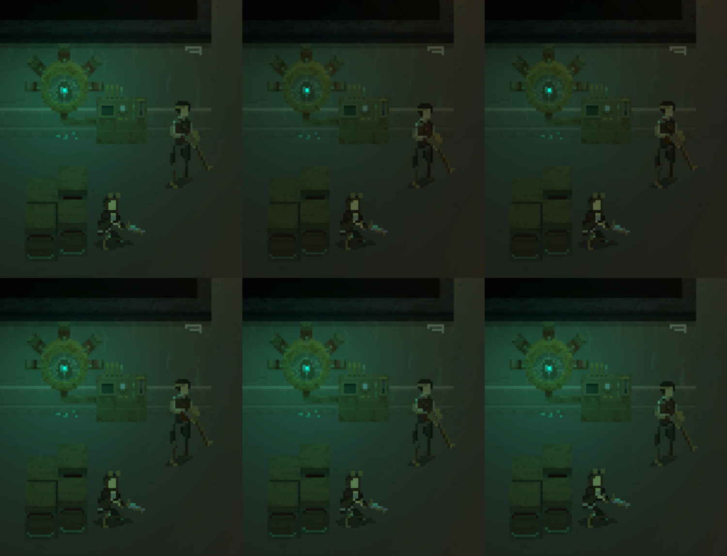
The other light sources that I added include a small wall lamp, and a... lamp placed directly inside pavement?
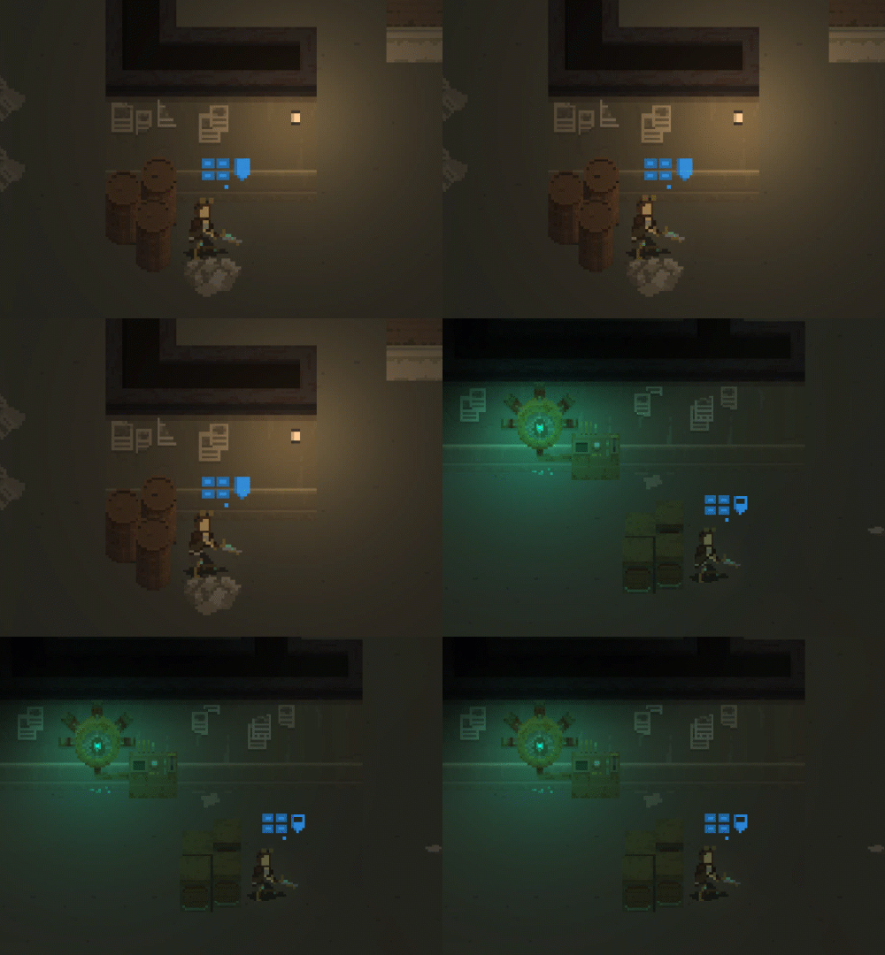
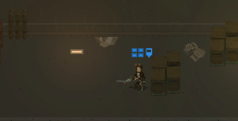
I don't fancy the latter, so I am pretty sure it will get replaced with something else. I need a regular lamp post obstacle anyway (as I need more high-cover elements that can be placed on a pavement), so it might be that it will replace that floor lamp later.
New character model
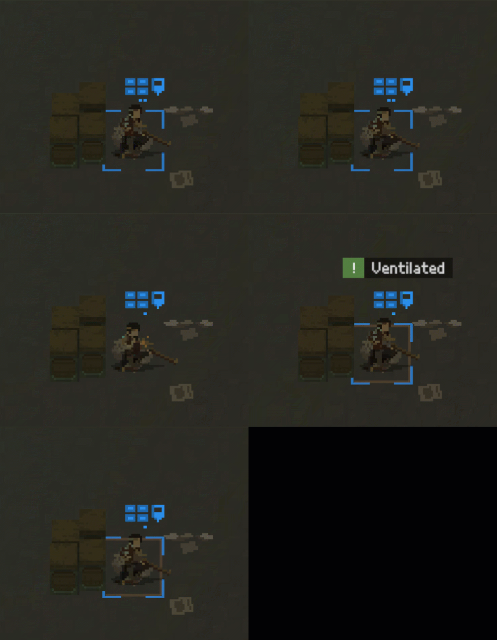
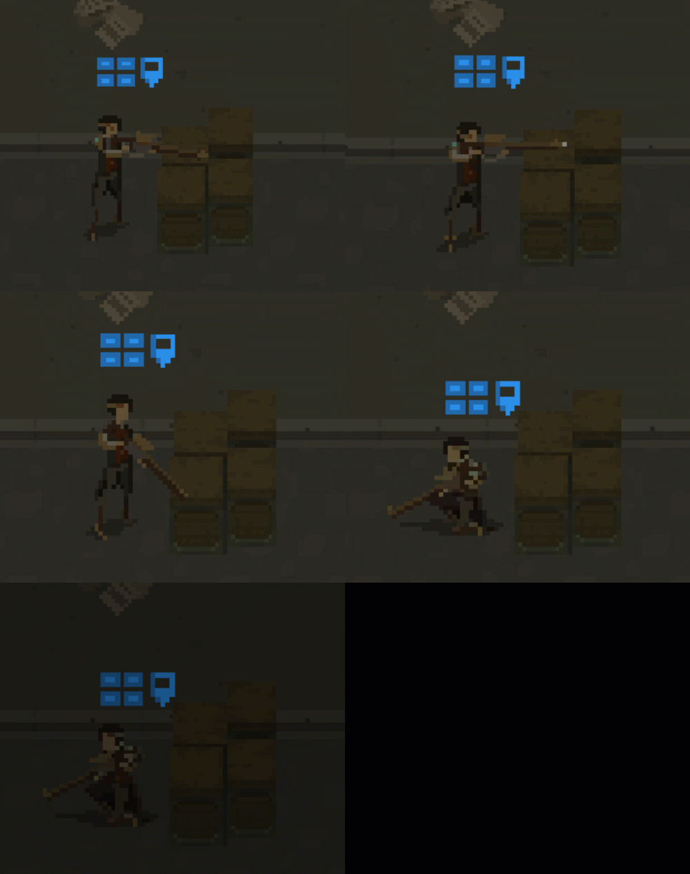
Kurt has finished most of his work on the ranger character assets (kind of a sniper class) which I've incorporated into the game. This has increased the number of character models used in the game by 50% (from 2 to 3) - now that's a progress, isn't it? ;)
Future plans
Now, I might still be spending time playing with tweaking the lighting system - but I don't want to get stuck. So the next thing I will focus on is the UI - so displaying action icons, inventory, character information and so on.
That's it for this week - thanks for reading!
Shardpunk: Verminfall
A tactical squad-based survival strategy game based in a thoroughly stylised pixel-perfect steampunk setting.
More posts
- Devlog #140: Shardpunk is now live!Apr 13, 2023
- Devlog #139: Less than a week to launch!Apr 07, 2023
- Devlog #138: Release date reveal!Mar 24, 2023
- Devlog #137: Can a game be truly fair?Mar 04, 2023
- Devlog #136: Reflections on Next FestFeb 17, 2023
- Devlog #135: hand-holding tutorialJan 27, 2023
- Devlog #134: shelter phase changesJan 27, 2023
- Devlog #133: 2022 wrap-upDec 31, 2022
- Devlog #132: playtests in progressNov 25, 2022
- Devlog #131: combat tactics, and moreNov 12, 2022
Leave a comment
Log in with itch.io to leave a comment.