Fleshing out the UI
Ah, so I am back from winter holiday. Here's a summary of the new stuff that I managed to put in the game.
UI tweaks
The main goal of the milestone was making the UI look nicer. I made the buttons more round-ish, and reorganized the bottom parts of the screen. One of the major changes was moving the weapon overload warning from the bottom to the top of the screen, and making it more exposed:
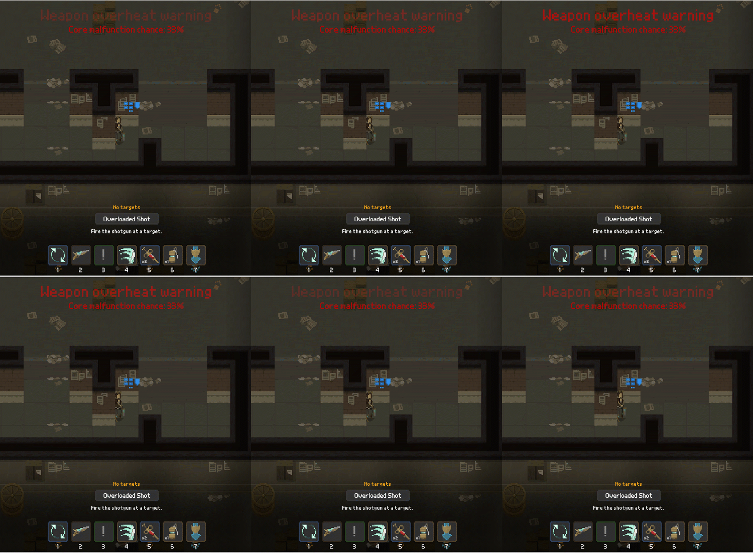
The overheating mechanism (that I described in one of my previous entries) turned out to be working just fine, so I decided to keep it. I am planning to dedicate one whole milestone just for fleshing it out in the future.
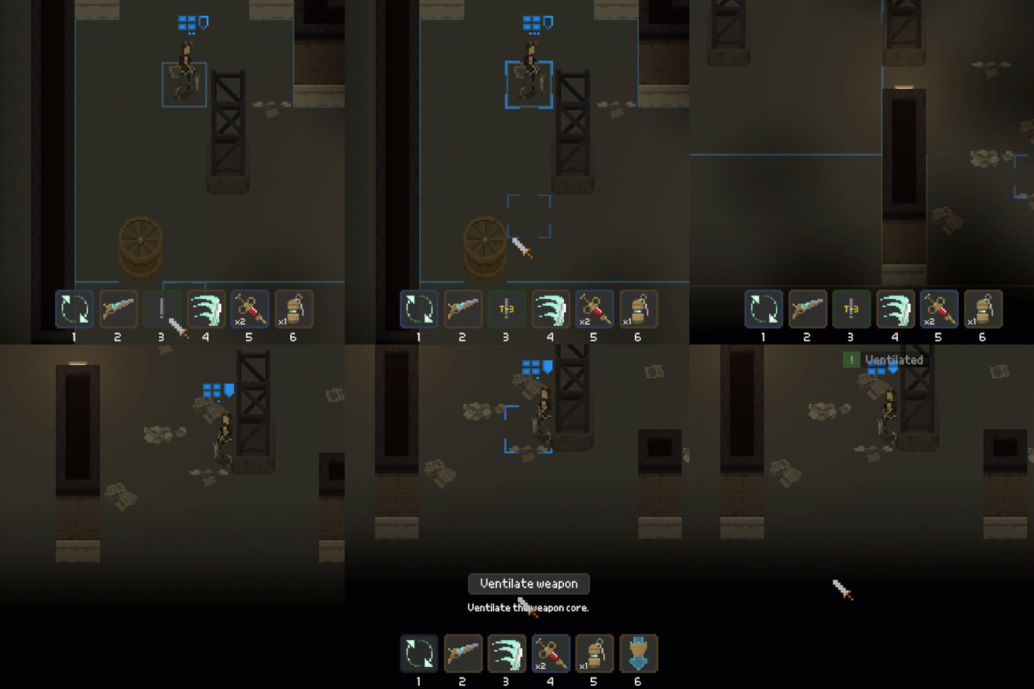
Also, I was experimenting with making sure that actions are displayed in a distinguishable way, depending on the amount of action points they consume. Tried coloring their backrounds, or changing the color of icons; in the end I simply colored outlines of action buttons.
So free actions are green; blue ones take 1 AP and orange ones: 2 APs. Also, to make the coloring consistent, the movement range is blue for moves that consume a single AP.
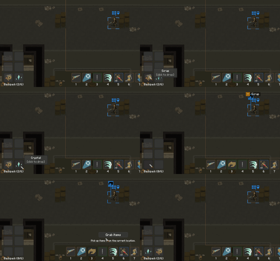
I've also added some tooltips for the inventory part.
And that will basically be all the UI stuff that I plan to change right now. I mean I could spend days doing this - but that's a recipe for disaster (i.e. never finishing the game).
New visuals
Now, in order to make the development process more diverse, I started to do some pixel art myself. Started with this Empire logo:
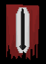
Now, the Empire owns the city in which the game action takes place. I won't be writing too much stuff about the lore yet - time will come for that.
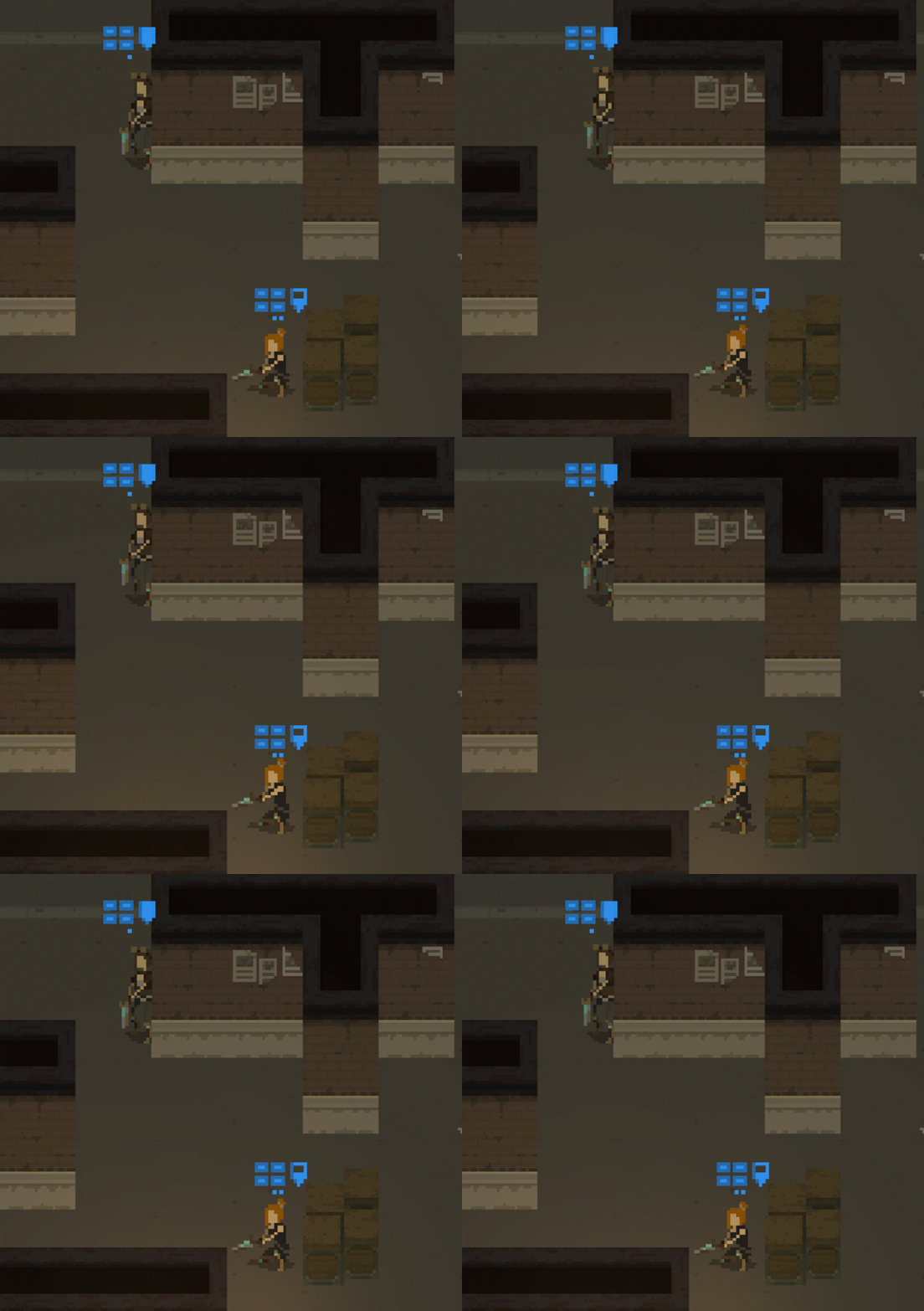
Additionaly, I've made a reskin of the rogue character - so now there are two models available for this character class:
What's next?
First of all, there's a lot of minor issues that need to be addressed (their number never seems to go down...). However, the main focus of the current milestone is to incorporate a bunch of quality of life changes (adding some more gameplay messages, making the enemy pod generation system more fair, etc. etc.). Also - maybe I'll be able to put some new graphics into the game. We'll see.
Bonus
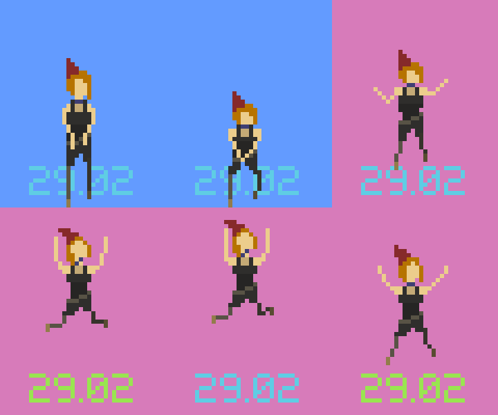
Ah, yes! It was my birthday recently! I mean... almost. I was born on 29th of February, so you get the idea ;) But - I managed to create this cheering rogue animation when practicing my pixel art drawing skills :)
Thanks for reading! If you'd like to receive more frequent updates about the development, follow me on Twitter at @bryquTheDev.
Shardpunk: Verminfall
A tactical squad-based survival strategy game based in a thoroughly stylised pixel-perfect steampunk setting.
More posts
- Devlog #140: Shardpunk is now live!Apr 13, 2023
- Devlog #139: Less than a week to launch!Apr 07, 2023
- Devlog #138: Release date reveal!Mar 24, 2023
- Devlog #137: Can a game be truly fair?Mar 04, 2023
- Devlog #136: Reflections on Next FestFeb 17, 2023
- Devlog #135: hand-holding tutorialJan 27, 2023
- Devlog #134: shelter phase changesJan 27, 2023
- Devlog #133: 2022 wrap-upDec 31, 2022
- Devlog #132: playtests in progressNov 25, 2022
- Devlog #131: combat tactics, and moreNov 12, 2022
Leave a comment
Log in with itch.io to leave a comment.