Rebalancing the game; new lighting system
Well, it turned out that making sure I am not involved in a single type of activity (e.g. audio stuff) was a good idea. I spent a little time on tweaking some of the sounds, but most of my time I was reiterating on making sure that the combat part is fun.
I already made sure that the map has a horizontal layout, now it was the time to tweak the way in which enemies are encountered. I changed the danger levels mechanism (which I've described in one of my previous posts) to spawn the enemies more often.
On the other hand, the initial number of enemy pods present on a map is not that big - two, maybe three. And the player does not meet them instantly. But after they do (or if they use grenades) there will be more and more enemies appearing.
Of course I don't want the player to be flooded with a very large number of enemy characters as moving all of them would take too much time (remember that this is a turn-based game). Now, XCOM 2 did manage to work around the issue in its War of The Chosen expansion: they introduced these zombie-like creatures there (the Lost) which spawn in massive numbers. However, all of the zombies were being moved simultaneously.
I am not sure I want to follow the same route (especially because my game code is not prepared to handle such stuff as of now), so instead of spawning more and more enemies, their tier increases.
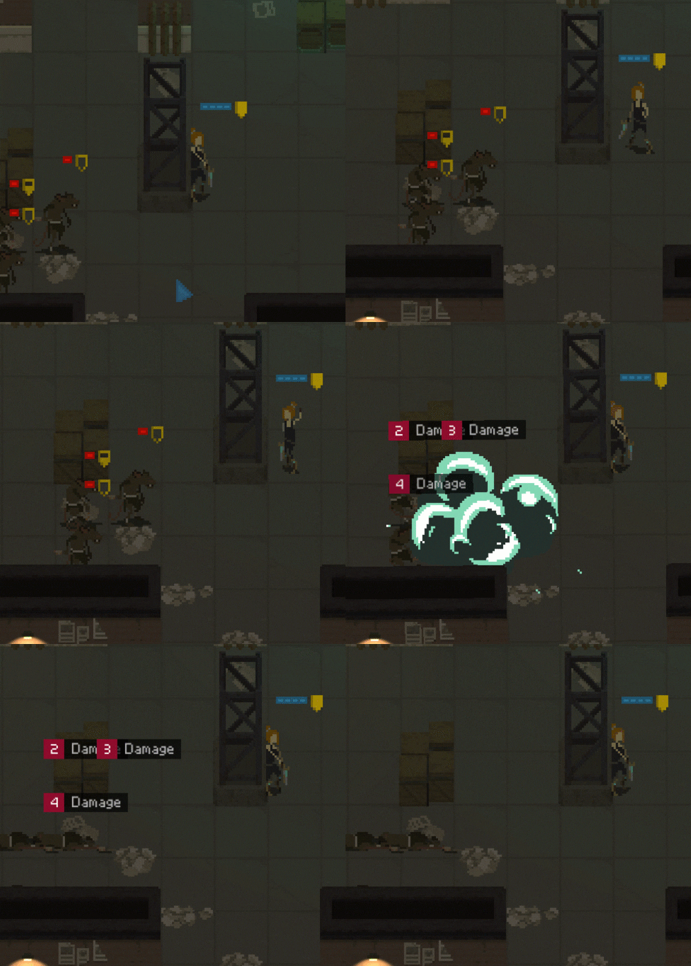
So initially the player can encounter melee rats and the ones with machine guns. Later on a heavy, armored version of the rats start appearing. I still need to add their sprites into the game, but here's a preview (created, as usual, by Kurt Prieto):
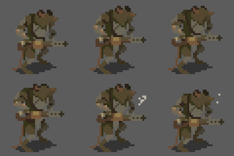
Anyways, I could go on writing about a new approach to death animations (I've reduced their number from 3 to 2, which allows to save time and money and is not really making that big of a difference for the gameplay...) but I have some other cool stuff to show to you.
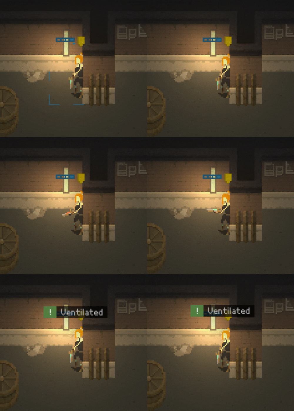
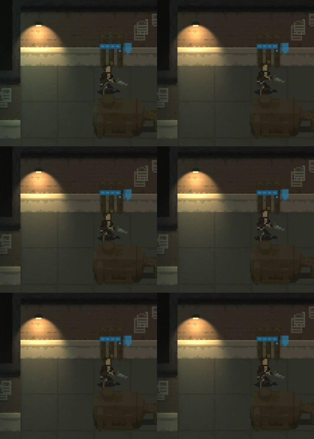
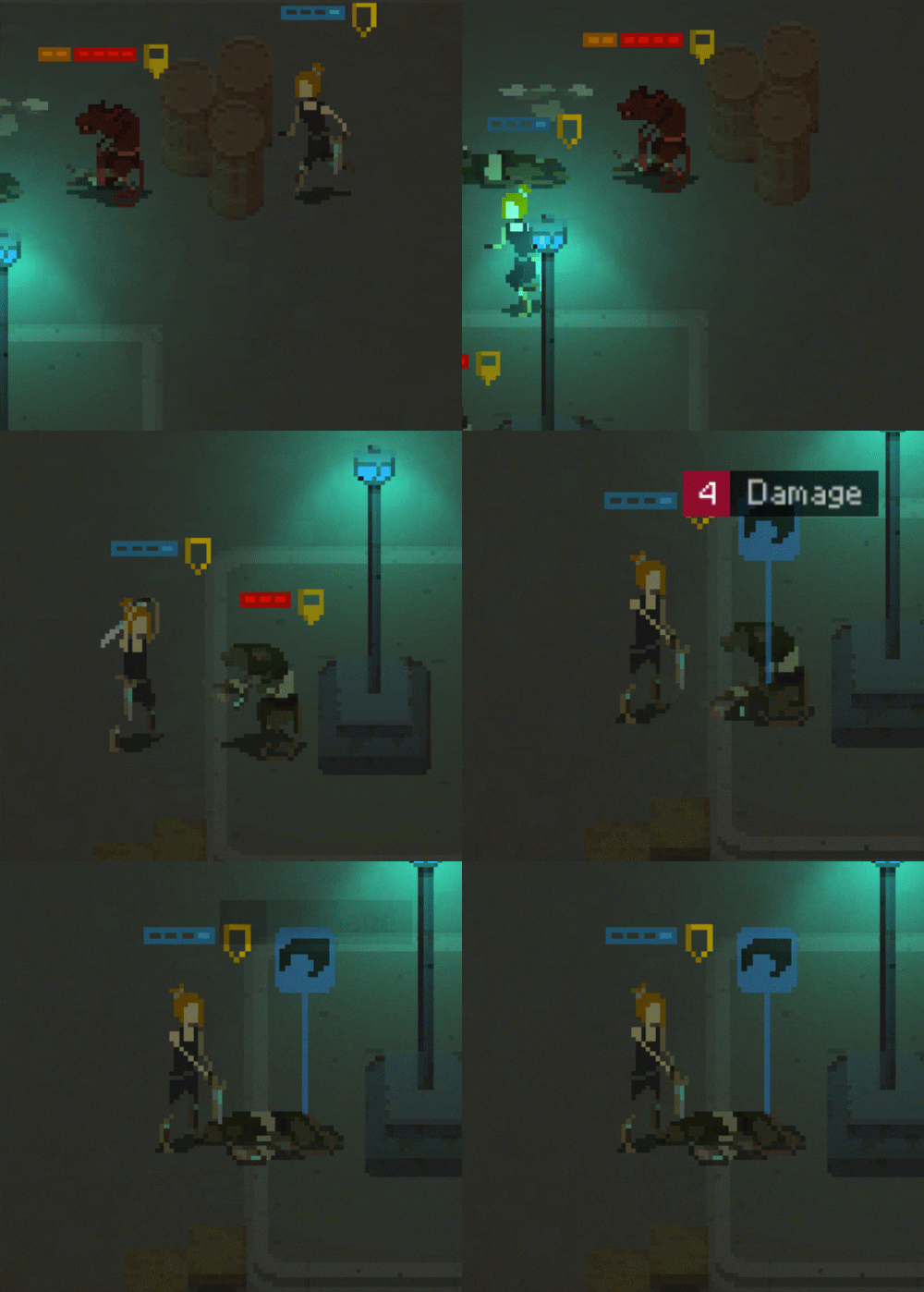
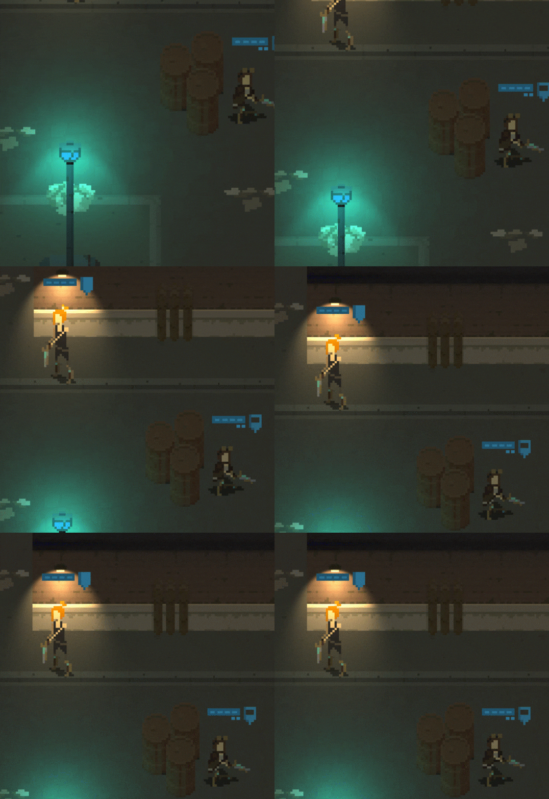
I was playing around with lighting in Unity, and only now realized that I can actually rotate a point light so that it actually looks good on a 2D plane. I know, that's very dumb of me that I ddin't think about it previously... but now that I did figure it out, I spent some time adding new light types into the game.
Here are some nice gifs:
What's next?
Well, I am still fleshing out the demo. I will surely focus on incorporating all animations of the heavy rat into the game, and creating sounds for it.
I would also like to experiment with handling diagonal movement/shooting/death animations to make the graphics feel correct in all situations.
Thanks for reading!
As usual, if you'd like to receive more frequent updates about the development and a heads-up about release of the demo, follow me on Twitter at @bryquTheDev.
Also, do help me out reaching a bigger audience by telling about "This is The End" anyone who you think could be interested in this.
Take care!
Shardpunk: Verminfall
A tactical squad-based survival strategy game based in a thoroughly stylised pixel-perfect steampunk setting.
More posts
- Devlog #140: Shardpunk is now live!Apr 13, 2023
- Devlog #139: Less than a week to launch!Apr 07, 2023
- Devlog #138: Release date reveal!Mar 24, 2023
- Devlog #137: Can a game be truly fair?Mar 04, 2023
- Devlog #136: Reflections on Next FestFeb 17, 2023
- Devlog #135: hand-holding tutorialJan 27, 2023
- Devlog #134: shelter phase changesJan 27, 2023
- Devlog #133: 2022 wrap-upDec 31, 2022
- Devlog #132: playtests in progressNov 25, 2022
- Devlog #131: combat tactics, and moreNov 12, 2022
Leave a comment
Log in with itch.io to leave a comment.