Devlog #43: optimizing time and costs
Creating your own game is great. Well, at least I feel like I'm having a blast doing it, even though it's a side project. The problem comes when you realise that your simply do not have enough time (and/or money, if you're outsourcing parts of the work) to create all that in-game stuff.
That's why you sometimes need to cut some things out of the game. Now, I am not talking only about removing in-game features (although this is sometimes also a good thing; I will surely write more about this in future blog posts), but about removing parts of visuals.
Character messages
So here's the thing: there's a feature in the game that allows player characters to randomly display some text, commenting on the current combat situation (when someone finds something, if someone is injured, etc. etc.). This is how I've been displaying such messages until now:
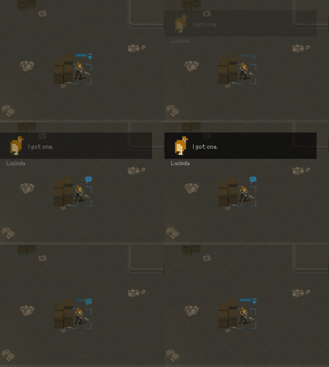
It looked nice and worked pretty well. However, there was one major downside. See, the message had a mugshot of the character displayed next to the text. Each character in the game will be randomly generated (well, from predefined assets), meaning that the mugshot would be different for every character.
Another important thing is that currently the mugshot being displayed above has wrong resolution - its pixels are too big and are not matching the rest of the UI. It means that a separate mugshot should be created for each possible character face preset. All of this only to make sure that a picture of currrently speaking character is displayed next to the text.
Alright, so now check out this alternate way of displaying messages:
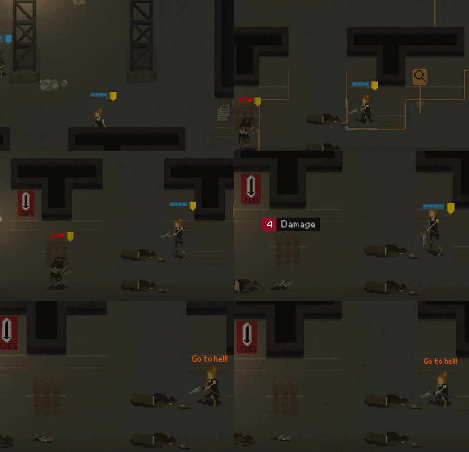
Displaying the text right above character's head completely removed the need for character mugshot pictures. This reduces the workload in a significant way. And looks cool - or maybe even cooler - than the original approach.
That being said, there is one particular type of character messages that still needs to be displayed in their original location, and these are messages from the person who is currently piloting the airship:
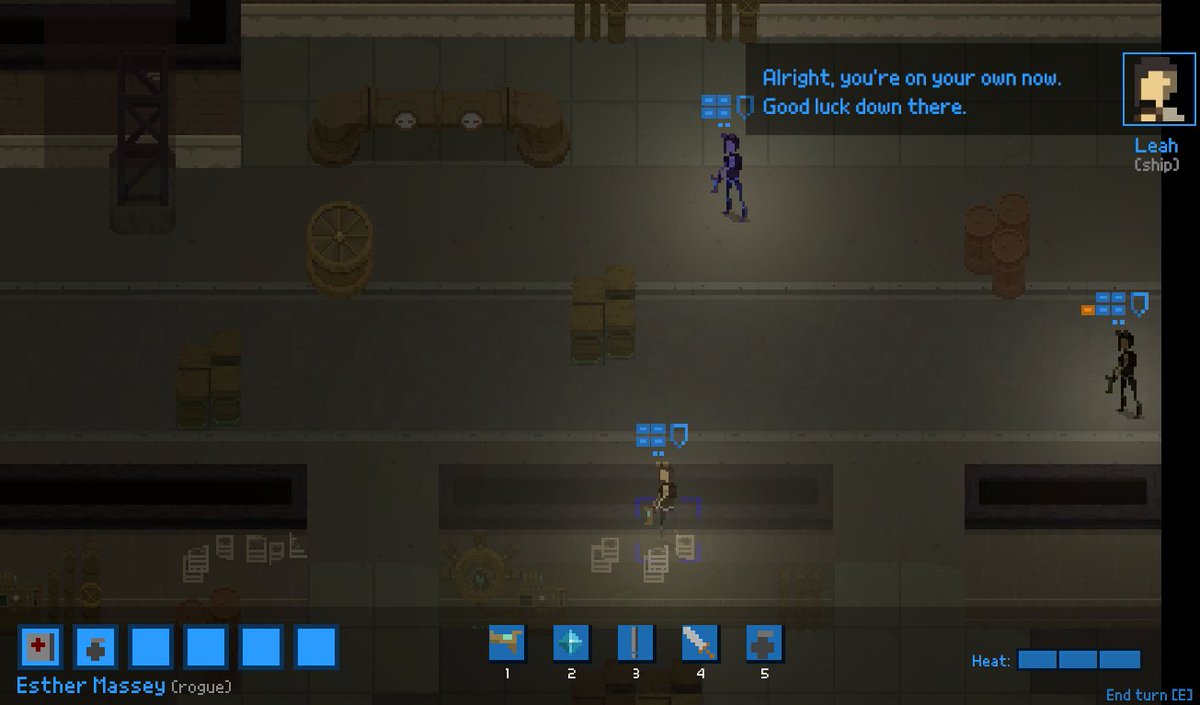
(that's an old screenshot - you can see that the UI is outdated - but the idea for the character message is the same)
Currently I named her Leah, and she's still using that low-res mugshot. That might be the only character needing a portrait, assuming that the pilot of the ship will always be the same.
Hiding behind walls
OK, so check this out: until now each character was having three major types of animations, depending on type of the cover they were hidden behind (no cover/low cover/high cover):
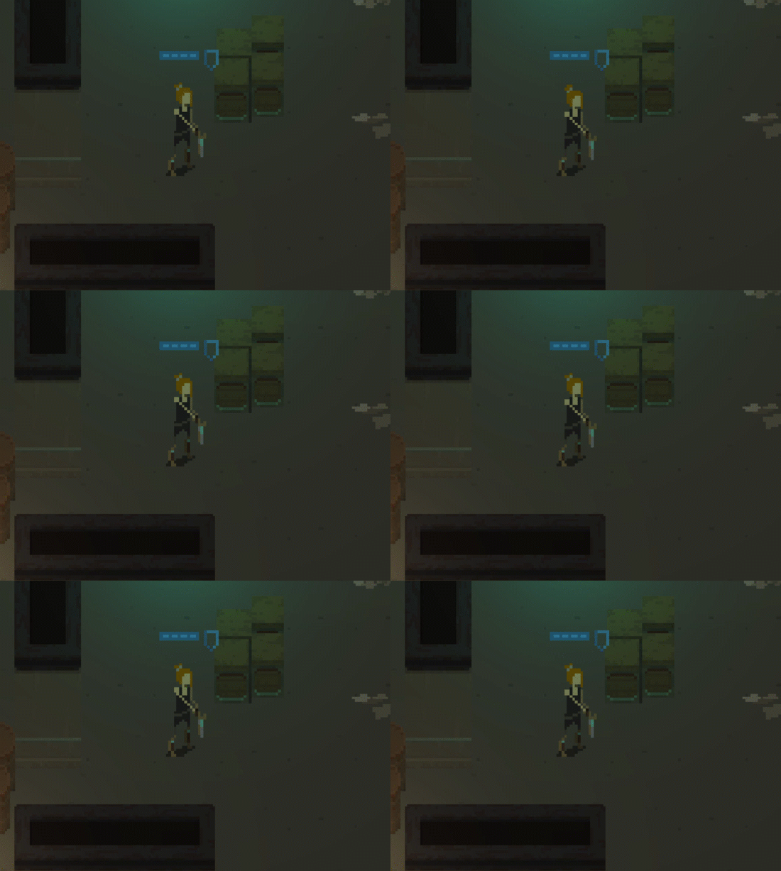
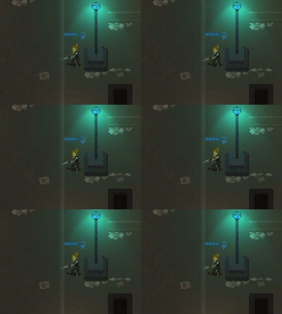
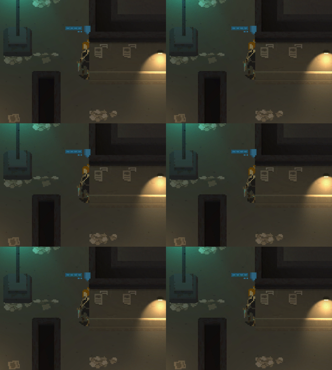
A lot of animations was supposed to be present in all three types, including idle, being hit, dodging a hit, multiple death animations (falling backwards, falling to front), healing, etc. etc.
Now this is a lot of animations. Especially if - as I mentioned before - there will be different character visual presets for each class. And yeah, I know that pixel art is all about hand-crafting all these beautiful animations, but come on - one has to know where enough is enough.
Additionally, high cover animations had one major difference - the characters were moved to the edge of their tile, meaning that transitions to movement/shooting/pickup/etc. animations were not that smooth.
So I've experimented with simply replacing the high cover animations with the ones from low cover:
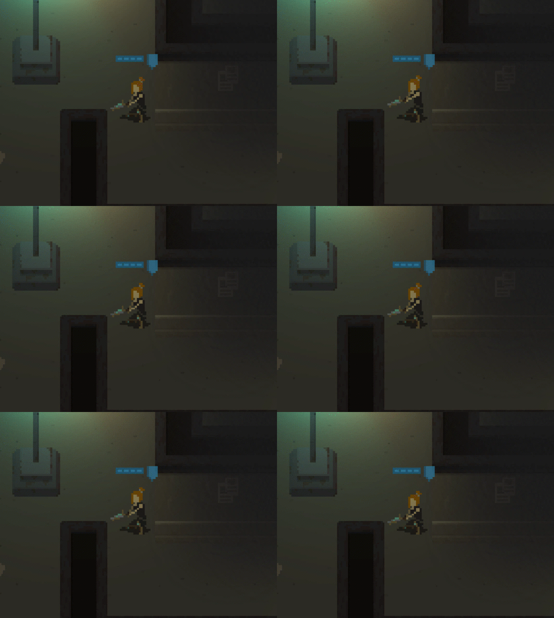
This made the life so much simpler (33% less animations needs to be taken care of). I have playtested the game with this change for a week now, and I am not missing the original high cover animations. The game still looks good.
What's next?
I am finishing work on combat tutorial messages system. Now, a holiday season has already kicked in - meaning that my children might require more attention from me - and I am not sure how this will influence my development speed. Time will tell.
Thanks for reading!
As usual, if you'd like to receive more frequent updates about the development and a heads-up about release of the demo, follow me on Twitter at @bryquTheDev.
Also, do help me out reaching a bigger audience! Share information about "This is The End" with anyone who you think could be interested in this.
Take care!
Shardpunk: Verminfall
A tactical squad-based survival strategy game based in a thoroughly stylised pixel-perfect steampunk setting.
More posts
- Devlog #140: Shardpunk is now live!Apr 13, 2023
- Devlog #139: Less than a week to launch!Apr 07, 2023
- Devlog #138: Release date reveal!Mar 24, 2023
- Devlog #137: Can a game be truly fair?Mar 04, 2023
- Devlog #136: Reflections on Next FestFeb 17, 2023
- Devlog #135: hand-holding tutorialJan 27, 2023
- Devlog #134: shelter phase changesJan 27, 2023
- Devlog #133: 2022 wrap-upDec 31, 2022
- Devlog #132: playtests in progressNov 25, 2022
- Devlog #131: combat tactics, and moreNov 12, 2022
Leave a comment
Log in with itch.io to leave a comment.