Devlog #44: making gameplay rules more clear
One of the common mistakes being made by indie game developers (at least from my experience) is not explaining the game rules enough for the players.
As a lone developer spends a lot of time creating and tweaking the game they obviously know all about the way game works and what is its goal.
And sure, you can just put a readme file in the game folder and hope that the players will peek in there to see what the controls are, or how some mechanics work. After all it's an indie game you're creating, so it should be a little rough around the edges, right?
However, I believe that - if possible - a game should clearly communicate some of its rules. And the best way to see whether a game is understandable enough is to perform a playtesting session with someone who did not see the game before. In my case it would be worthy to find a person who didn't play new XCOM games as well (so that such person is not aware of how the actions/movement system works there).
Luckily my wife matches most of the requirements above, and I've already got a lot of feedback from observing the way she was playing the game :)
Based on these observations, these are the current things I've added:
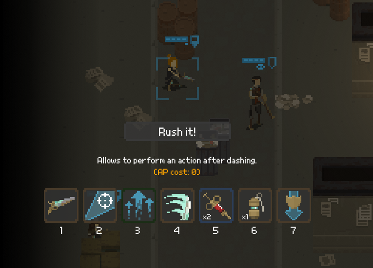
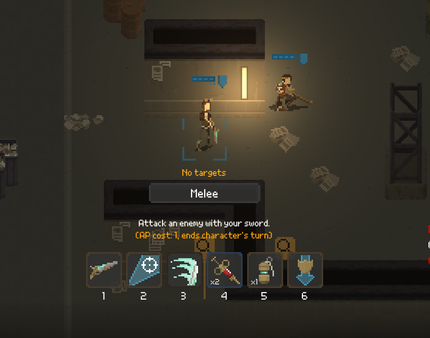
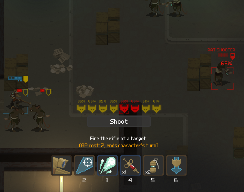
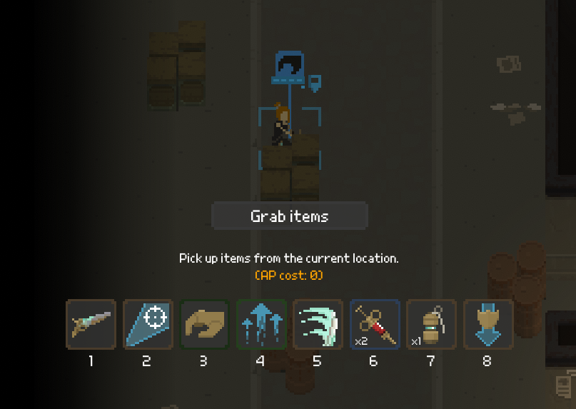
Clear indication of Action Points (AP) cost
Actions work in different ways. They have different AP costs. Additionally, some of them end player's turn, some not. Initially I was communicating this to the player using colors, but I decided to use some extra space to actually display this information via text:
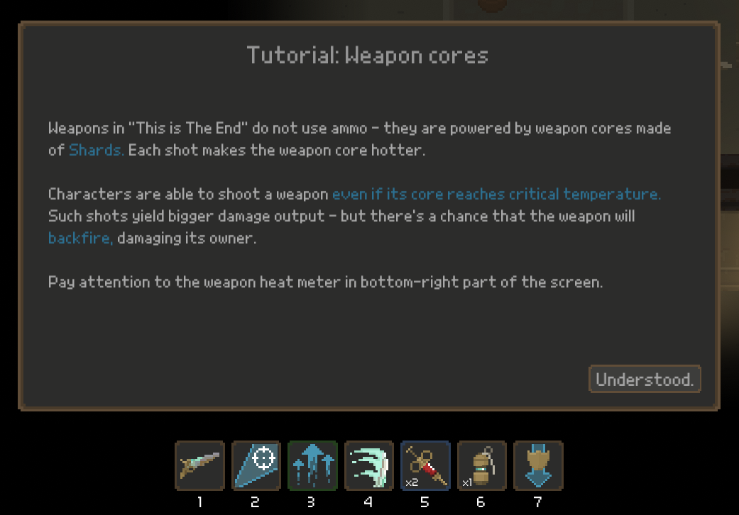
Tutorial messages
I've added these popup windows appearing during the game, explaining some core mechanics. For instance, the one below only gets displayed when first enemies appear:
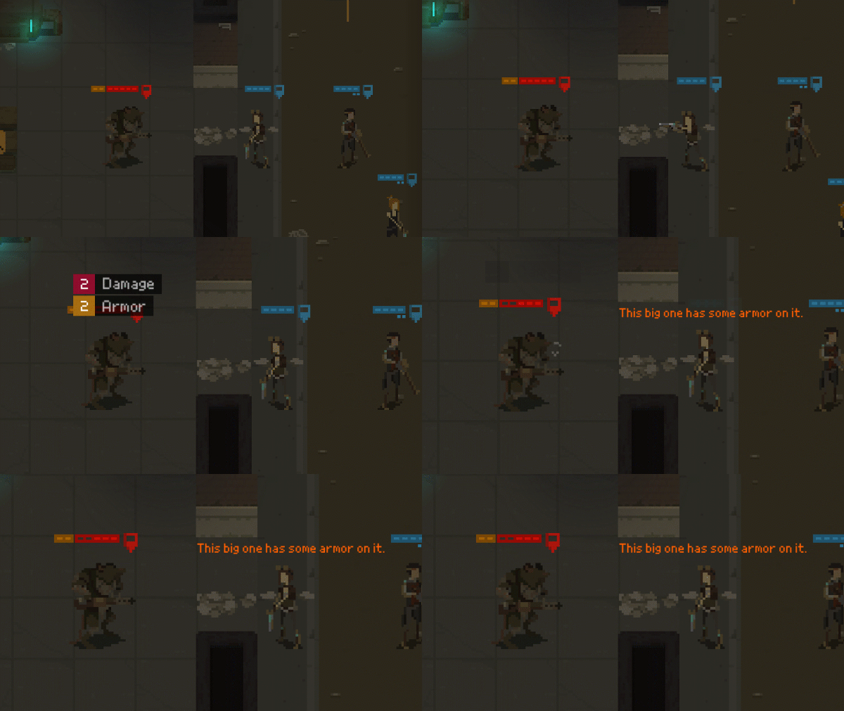
Helper character messages
I am not a big fan of tutorial popups, so wherever possible I am using more immersion-friendly approach. Here's a character informing the player that this enemy type is armored:
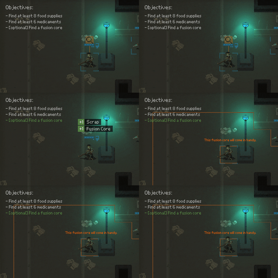
Mission objectives
Yeah, It would be great for the user to actually know what the objectives of the mission are. Now, the demo will be about that supply raid mission which is about gathering as much stuff as possible. For the sake of the demo I made an assumption that the group needs some minimal amount of supplies to survive in the game world and I've introduced a win state to the demo mission - you will succeed if you gather some food, medicaments, and (optionally) a fusion core:
What's next?
My holiday break is closing in, but I should be able to put one extra devlog entry before it. I am planning to work on some in-game menus.
Thanks for reading!
As usual, if you'd like to receive more frequent updates about the development and a heads-up about release of the demo, follow me on Twitter at @bryquTheDev.
Also, do help me out reaching a bigger audience! Share information about "This is The End" with anyone who you think could be interested in this.
Take care!
Shardpunk: Verminfall
A tactical squad-based survival strategy game based in a thoroughly stylised pixel-perfect steampunk setting.
More posts
- Devlog #140: Shardpunk is now live!Apr 13, 2023
- Devlog #139: Less than a week to launch!Apr 07, 2023
- Devlog #138: Release date reveal!Mar 24, 2023
- Devlog #137: Can a game be truly fair?Mar 04, 2023
- Devlog #136: Reflections on Next FestFeb 17, 2023
- Devlog #135: hand-holding tutorialJan 27, 2023
- Devlog #134: shelter phase changesJan 27, 2023
- Devlog #133: 2022 wrap-upDec 31, 2022
- Devlog #132: playtests in progressNov 25, 2022
- Devlog #131: combat tactics, and moreNov 12, 2022
Comments
Log in with itch.io to leave a comment.
Big fan of the use of dialogue to provide scenario info in a non-hamfisted way!
Yeah, it does make a difference, right? Sadly, I am unable to remove these popups from all the situations that require some explanation. But maybe I'll find a way in future iterations :)